iOS + Android App
January 2020
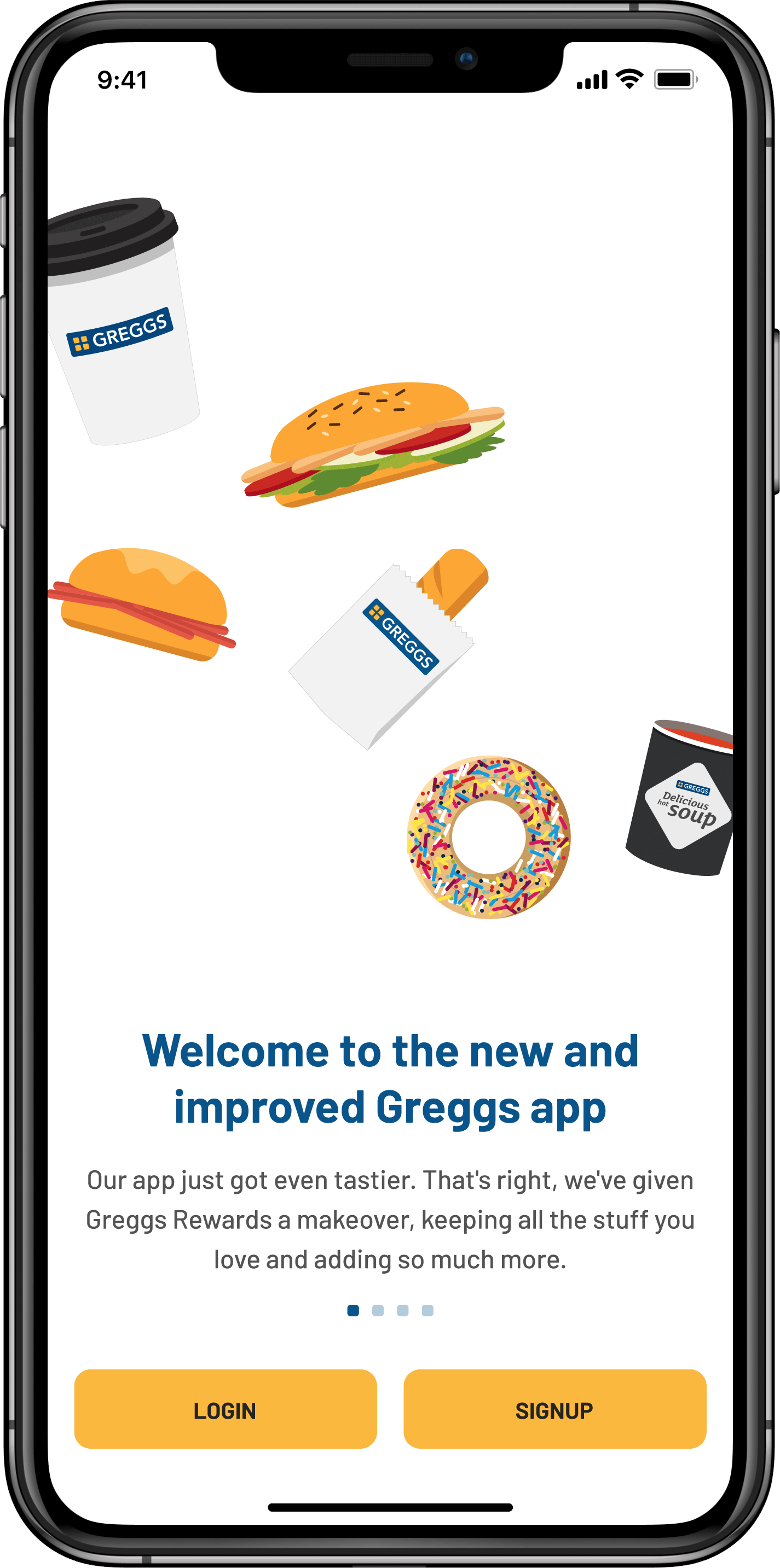
Designing a tasty end-to-end mobile app during a global pandemic
January 2020
Greggs is a leading food-on-the-go retailer with more than 2,000 shops across the UK. Founded in 1939, the company thrived in the retail space but needed some help competing in an ever-growing digital market.
Rather than continuing to rely on external agencies, they created a brand new in-house digital product team and brought myself on board to lead the design. Our team was tasked with the challenge to bring all things Greggs together in one place through the creation of a new flagship app that aimed to:
Re-platform the current Greggs Reward App
Create a simpler, more coherent, user journey
Increase customer loyalty
Add new revenue streams
Principal Product Designer
iOS & Android app
1 Designer
4 Engineers
1 Product ownder
1 Engineering manager
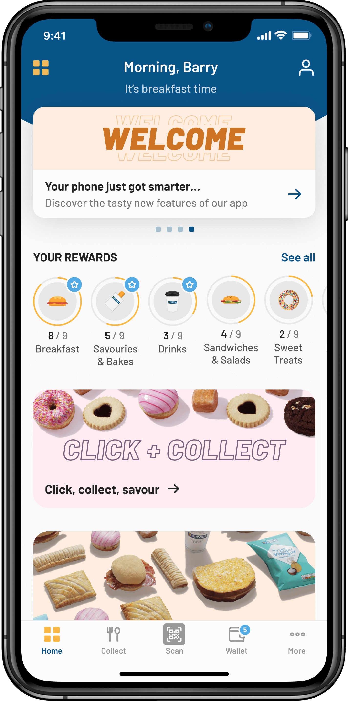
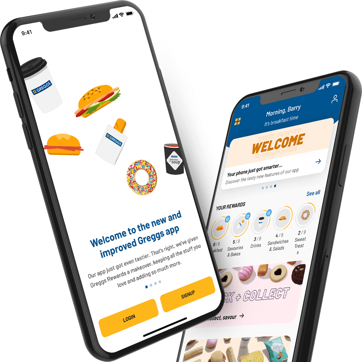
Final UI
As a new team we had a lofty goal of creating the best food-on-the-go app on the market. We had a big opportunity to offer customers new value propositions such as:
Re-platform the current Greggs Reward App
Create a simpler, more coherent, user journey
Increase customer loyalty
Add new revenue streams
This digital experience became even more important with the ongoing COVID pandemic to give customers a contactless service option.
We were also going through a rebrand and thus had the opportunity to align our digital products with a consistent look and feel, conveying that unique Greggs charm that customers love.
Research
User flows
UI exploration
Hi-fi designs
Prototyping
Usability testing
Implementation
New ways of working
We were a brand new team, introducing agile ways of working to the business. I therefore put a lot of effort into coaching and setting expectations with senior stakeholders to improve design maturity across the board.
Lack of data
We didn’t have enough good quality data or analytics to understand deep user behaviours in the app, so we had to synthesise data from various sources like app store feedback and customer care teams.
Juggling multiple stakeholders
We had to balance stakeholders from various parts of the business (e.g. brand, marketing, retail and legal) all with different levels of experience and viewpoints.
Using Flutter to build the app
For speed and cost reasons we decided to build the app in Flutter, the cross platform framework by Google. From a design point of view this meant we had to create several components that would usually have been native – adding QA effort and time pairing with engineers to understand what was possible.
Covid
As a traditional retail business, lockdown restrictions hit the business hard. With a sudden and complete stop in revenue and the majority of the workforce on furlough, it was imperative that I quickly adapt to changing priorities and pivot temporarily from the app to a standalone Click + Collect service.
Team changes
Four product owner changes, increased participation from the Head of Brand and the addition of a Programme Manager half way through created an ever changing environment with sometimes conflicting demands.
In order to understand what our customers thought about the existing app, I needed to analyse the app features and functionality, and dive into any customer research I could get a hold of.
I started by talking to the customer care team as they have the most interaction with customers and would understand the main customer pain points. I also reviewed all of the app store feedback and grouped the feedback into different themes.
From doing this initial research and talking to the customer care team I learned a few things:
The app was unstable and had a lot of connectivity issues which caused frustration with our customers
It was not clear to customers when rewards were available
Customers wanted the ability to use the app offline
Customers wanted the ability to order in advance
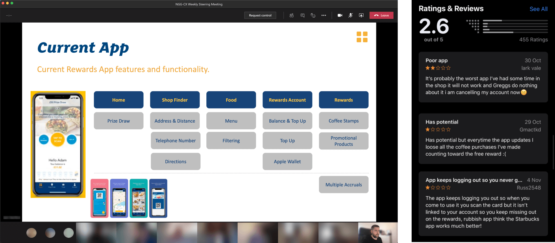
Stakeholder presentation and app store ratings
In tandem with the initial research and analysis of the existing app I also reviewed the data we had available from Firebase (from Jan 2019 - Jan 2020). This quantitative data gave us insight into how our customers were using the app and helped us define areas of improvement.
Some of the key research findings were:
Post 2pm was the quietest time
Only 15% of customers top up their wallet
Customers who top up purchase 174% more than other customers
Some of the actions we took based on these findings were:
Refining our sign up process to decrease drop-offs
Increased number of sign-ups by adding a free hot drink as an incentive
Introduced a push notification strategy that emphasised current deals and increased orders after 2pm
Repositioned our top-up feature to focus more on our most loyal customers
After digging into the research I moved to competitor analysis to get a deeper understanding of the food-on-the-go app market. This helped us identify any shortcomings and understand what features customers might expect to find in the Greggs app.
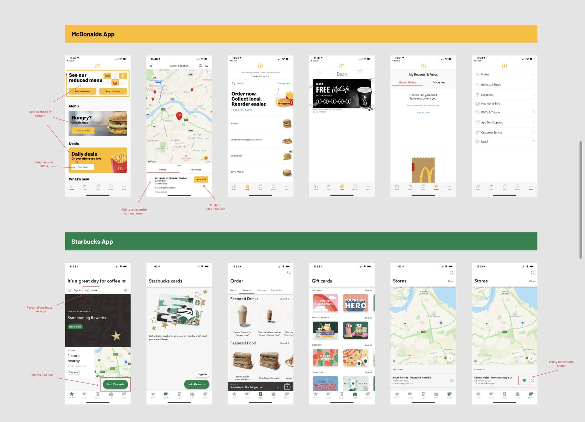
Competitor analysis and benchmarking
I presented our research findings to the business at our fortnightly board meeting and we signed off our plan for the initial user journeys and MVP feature list. This was an important step to make sure the chain of reasoning was clear and transparent, aligning the team and our stakeholders around a shared vision.
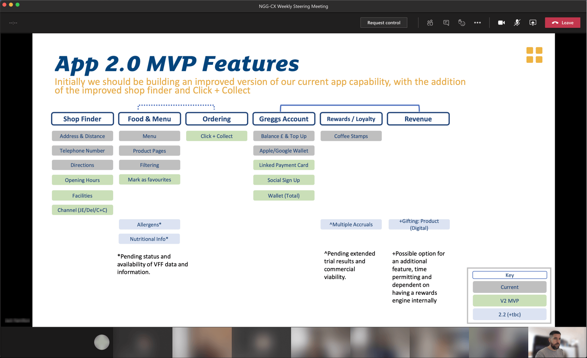
Stakeholder presentation
Next up, using Whimsical, I mapped out the agreed user flows in more detail to define common journeys and get a clearer picture of the new app IA. This also helped flag some potential pain points early on, such as the amount of validation in our signup flow – which we reworked to create a more simple and effective flow to reduce customer frustration.
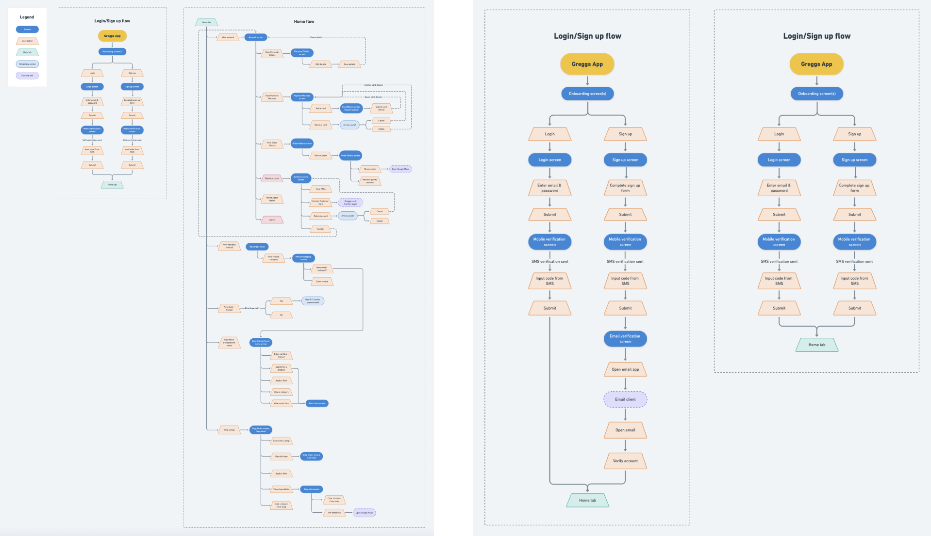
User flows in Whimsical
I went off on paternity leave to welcome my baby girl into the world. A few sleepless weeks later, I began preparing to ease back into the old familiar routine of work.
Then the COVID pandemic hit...
At a time when the nation was in lockdown and shops were ordered to close, a complete and immediate business transformation had to take place. All work on the mobile app paused to focus on a new Click + Collect service as an indispensable source of income.
To be able to safely re-open shops, we needed an effective, contactless system that worked at scale. With revenue on pause and nearly every member of staff on furlough I was faced with the challenge of designing this… on my own… in just a few weeks… with a newborn at home. Yikes!
View the website live here:
order.greggs.co.ukFollowing the success of the CC service (now available across all 2000+ Greggs stores) it became a priority to add this feature into the mobile app.
Moving back to the app, we still had a lot of work to do. I started by creating some wireframes to shape the core app structure and information architecture. Working with pencil and paper was a quick, iterative approach.
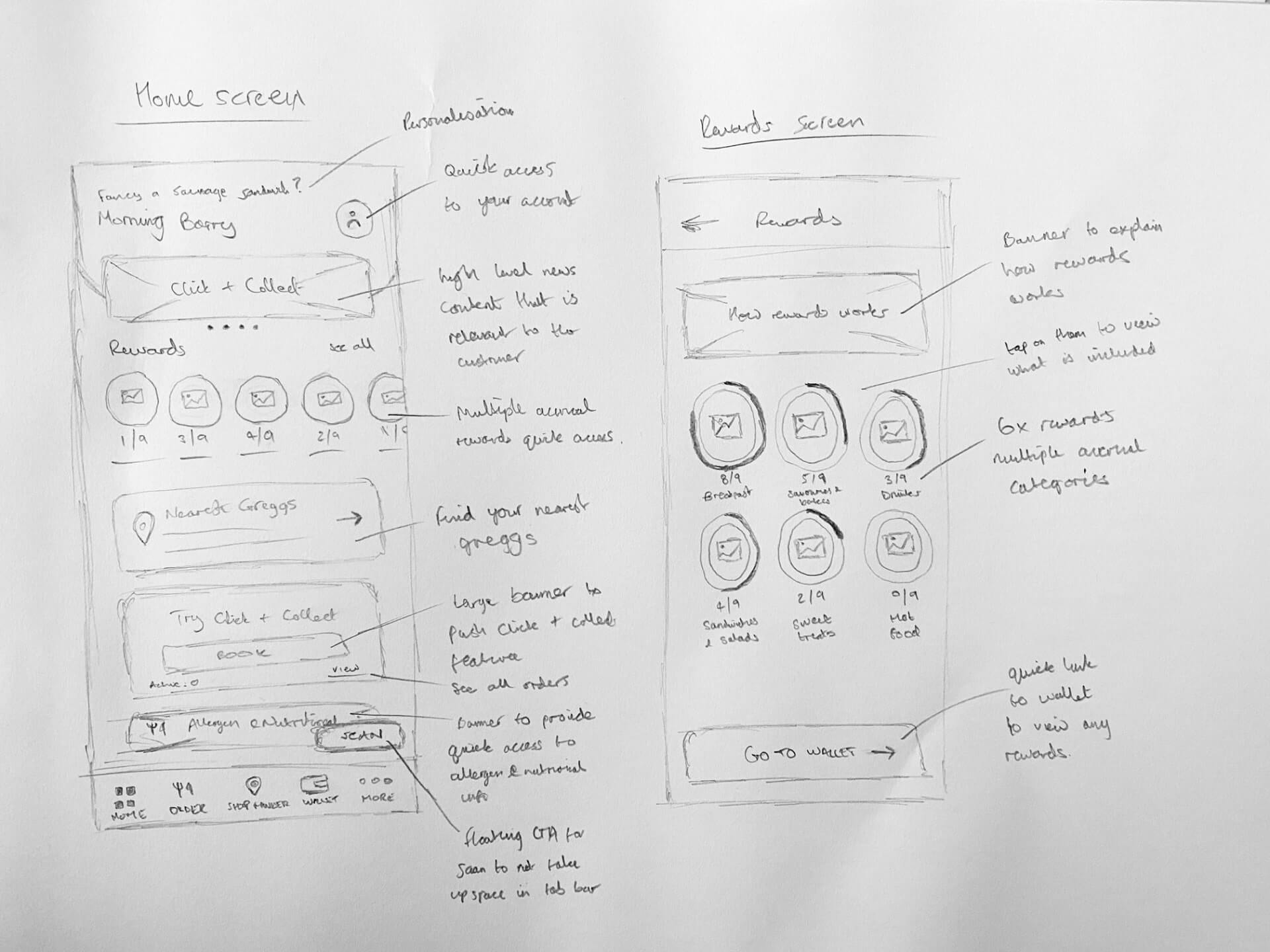
Early wireframes
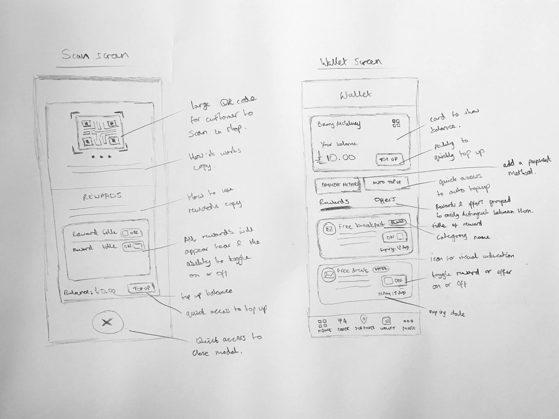
Early wireframes
As I moved to higher fidelity designs we started to get a lot of conflicting feedback and differing opinions on the tab bar and what the top level items should be. To rectify this and to give us more user focused feedback I decided to carry out a card sorting exercise.
I recruited 10 participants internally and asked them all to sort through a list of features (chosen due to their potential high frequency of use) that they’d want to see in the tab bar.
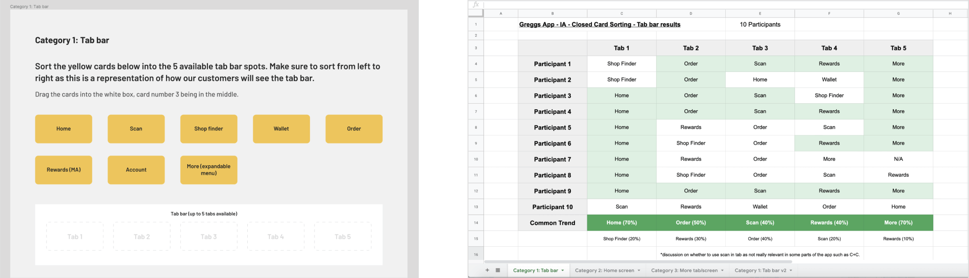
Card sorting
This was very successful in showing the senior stakeholders why it’s important to do research and how quickly we can carry this out to remove opinions and be more customer-centric.
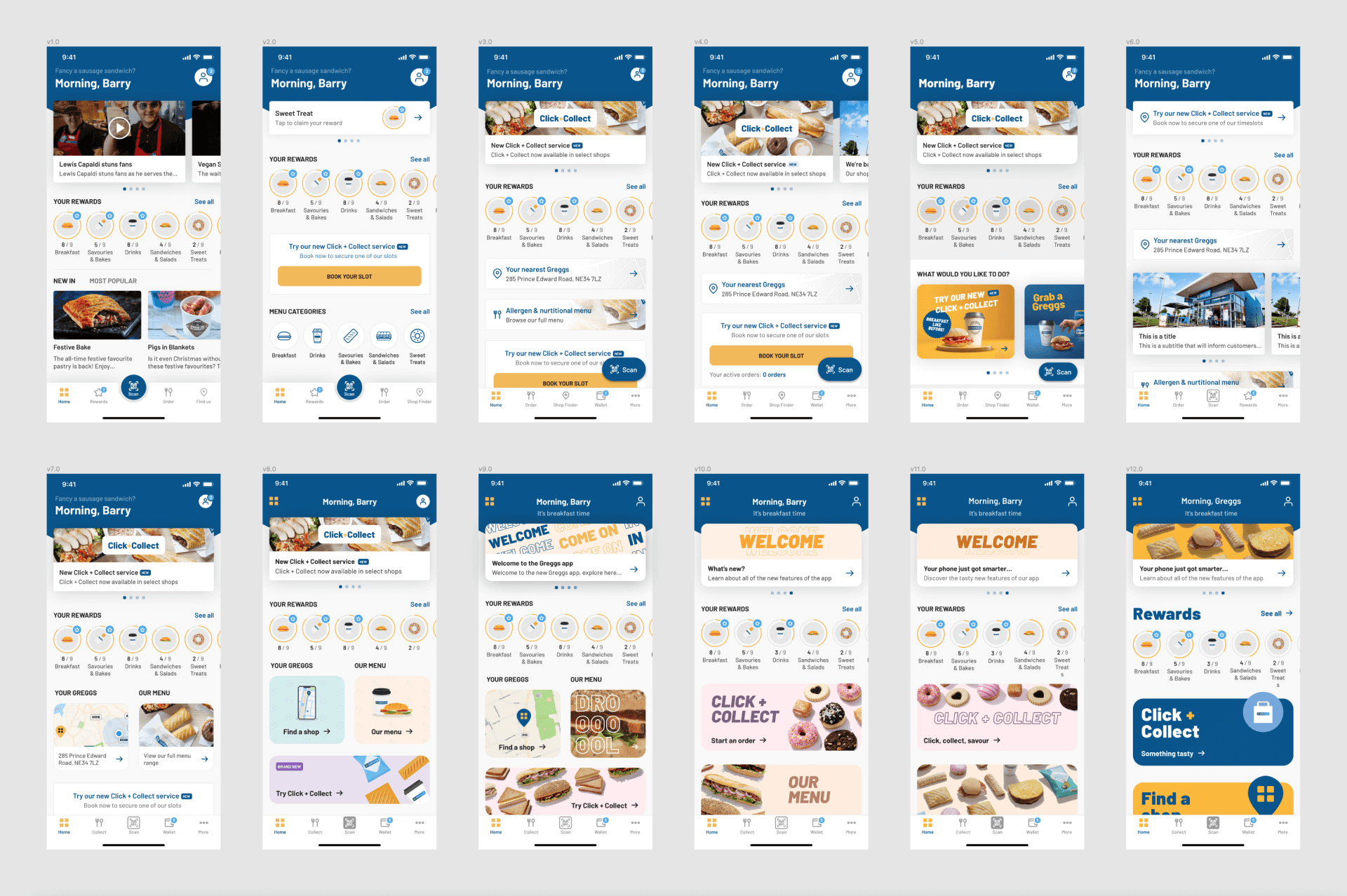
Various iterations of the home screen
Throughout the process I shared my designs early and often with the whole team to allow for a more inclusive approach. As you can see we went through numerous different iterations of the home screen in particular to make sure we got to a design that was clear and concise but still conveyed the Greggs personality.
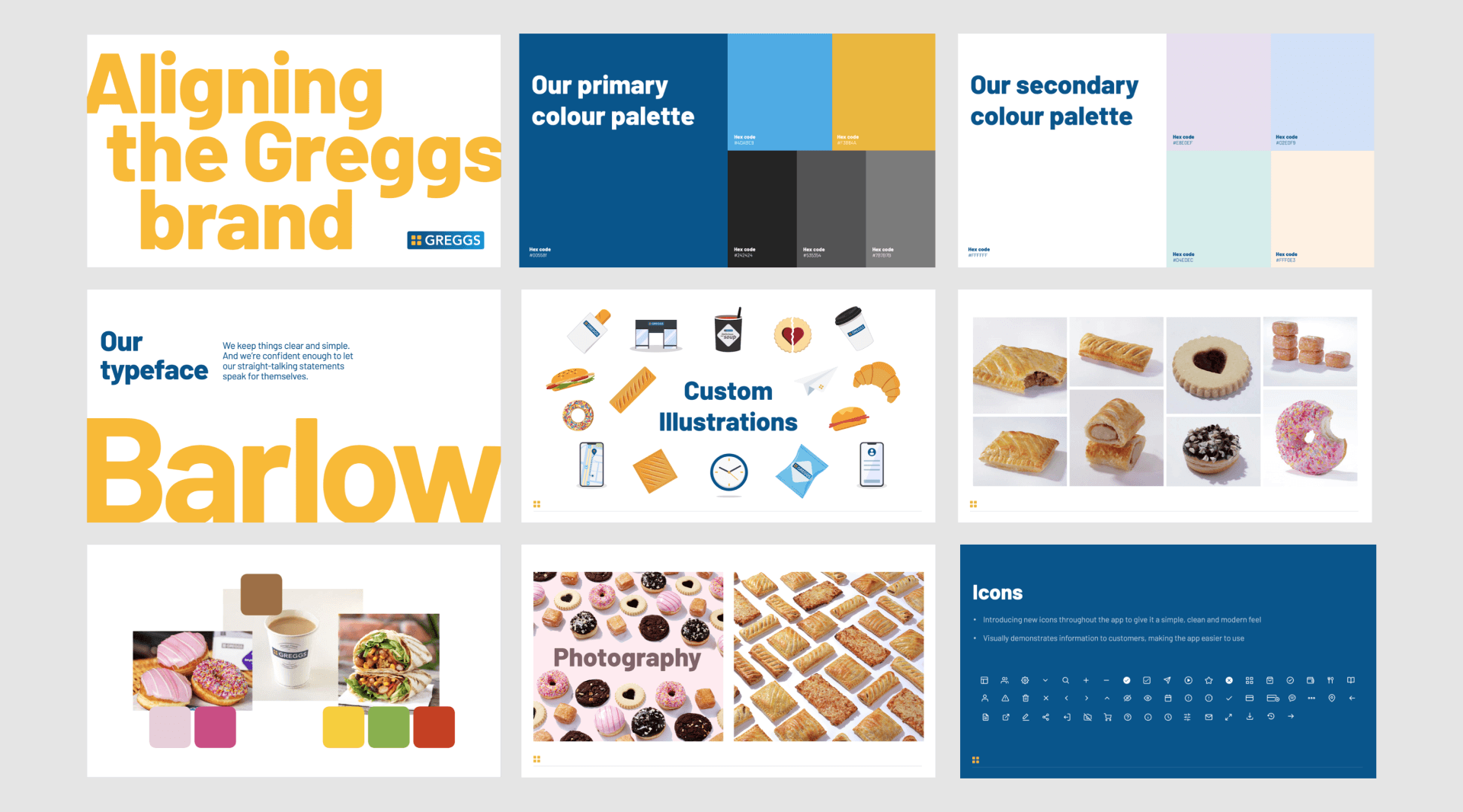
During the redesign of the mobile app Greggs were also undergoing a rebrand to modernise their identity. In partnership with the Head of Brand I also created some secondary colours, custom illustrations and icons as well as iterating on creative ways that we could showcase our photography.
For the mobile app specifically, I created a new design system from scratch in Figma that became a living document for the team to understand core components and artefacts within the mobile app.
Greggs design system artifacts
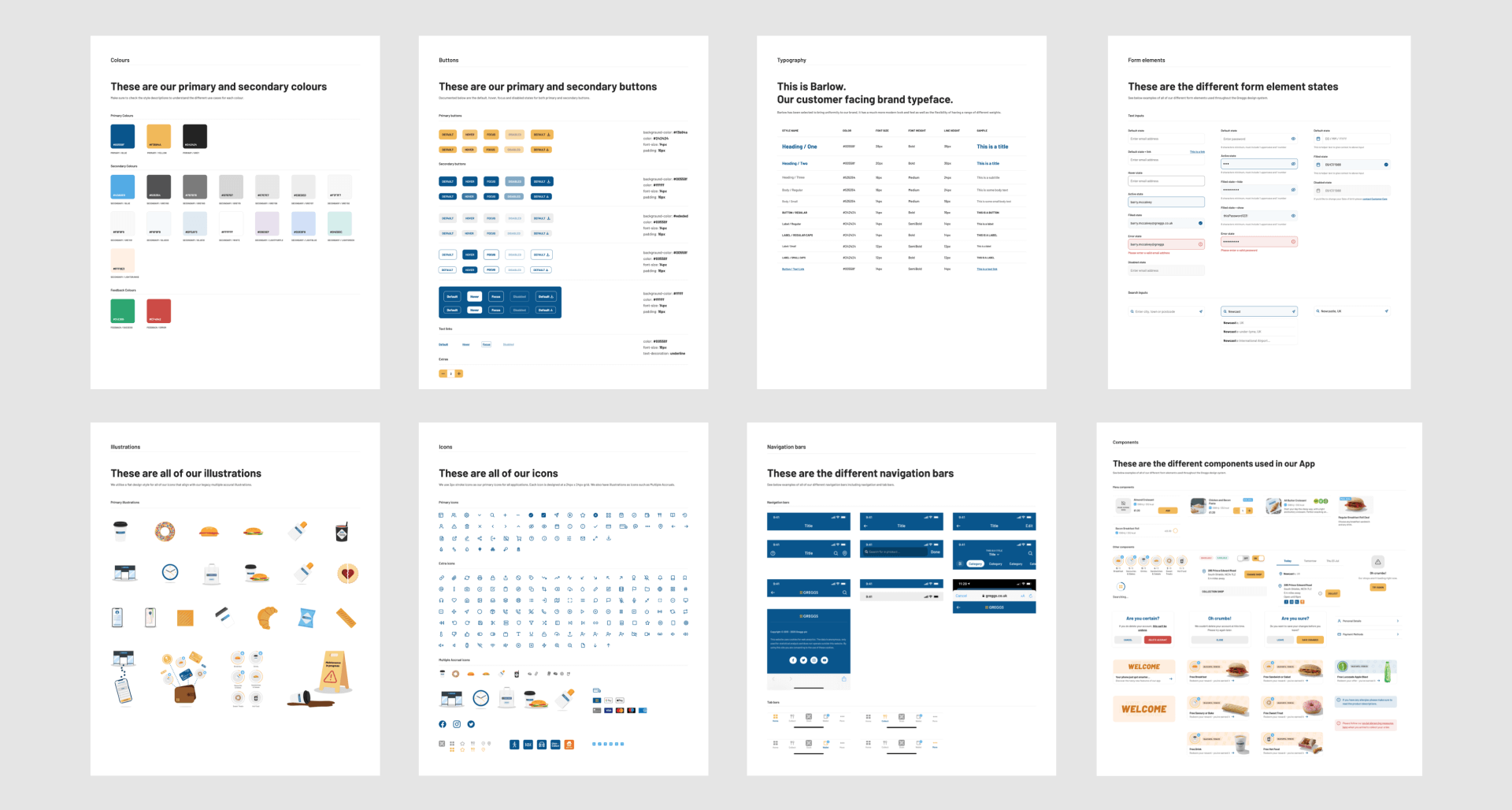
App design system artifacts
After getting sign-off from the Head of Brand and taking our team through the designs I had to present the new proposed Greggs app to the board of directors (including the CEO) to make sure we had buy-in from everyone. In partnership with the Product Owner we walked the board through the app development so far, focusing on the road map, core features of the MVP and the strong rationale for design decisions.
3 amigos
Refinement
Build
Design QA
Release
Retro
In addition to defining the new UI, I built specific prototypes to show detailed interaction states to the engineers.
I also helped foster a more iterative approach to the design handover process by introducing a new Design QA step in the process. This was used to not only make sure quality was always at the forefront but also to make sure there was a collaborative partnership between design and engineering.
Onboarding
Login

Home
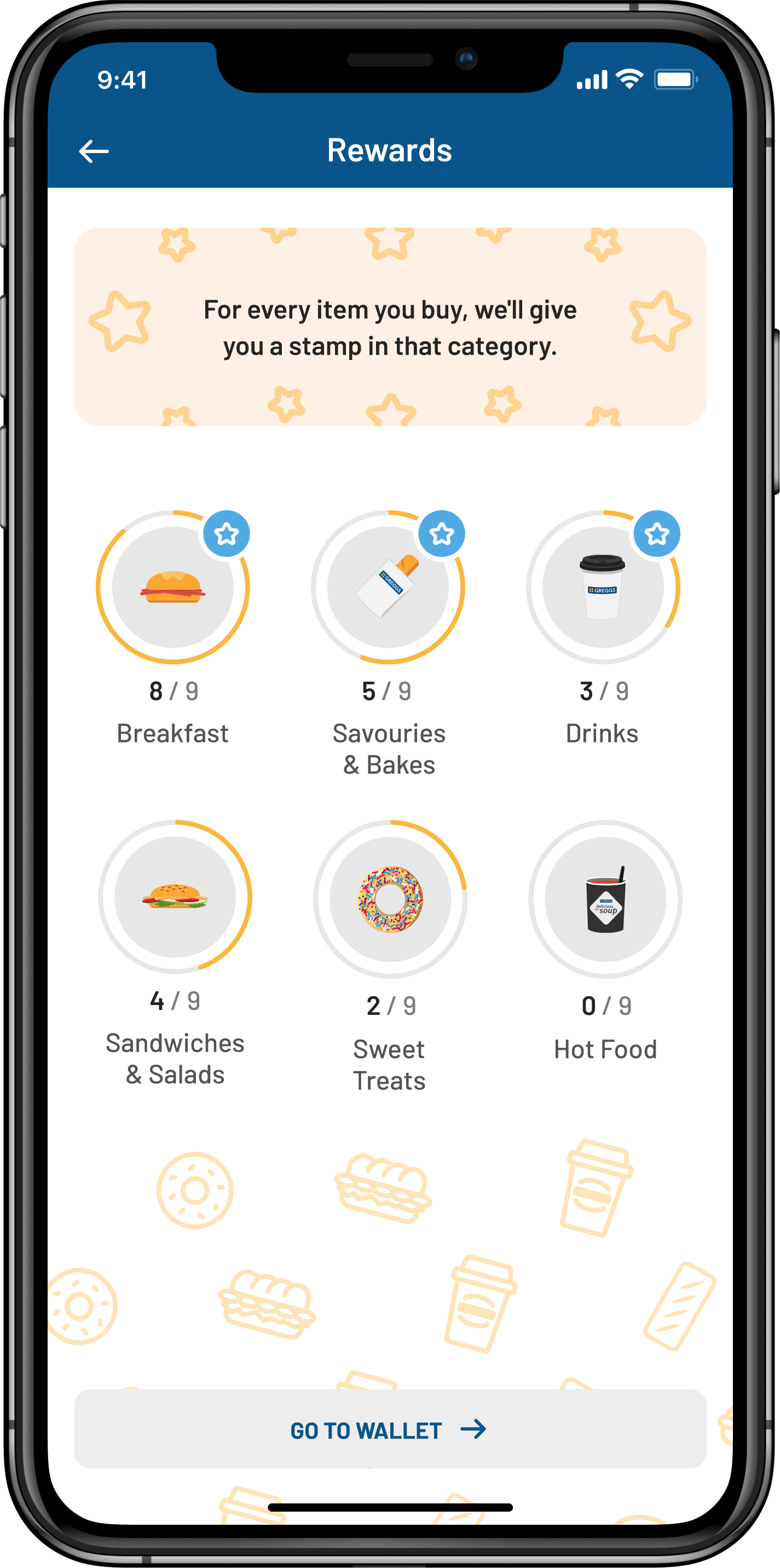
Rewards
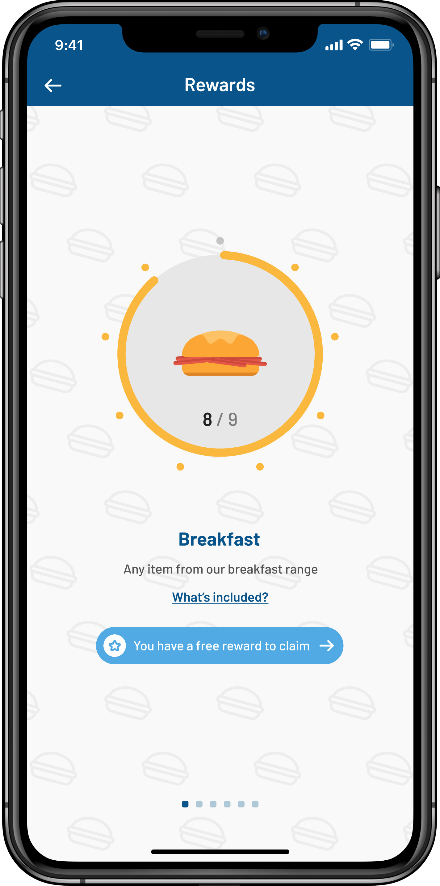
Rewards category
Scan
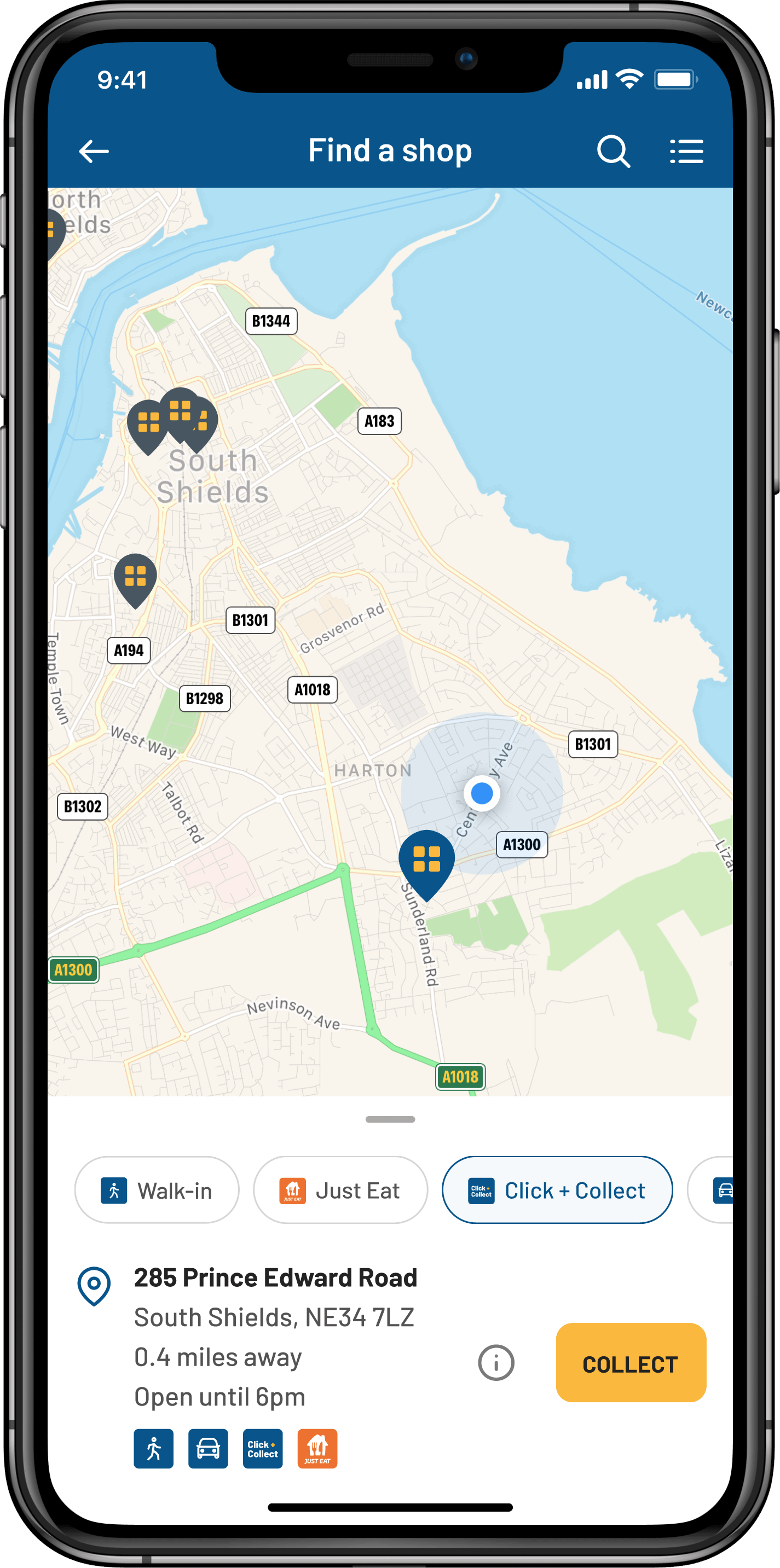
Shop finder map view
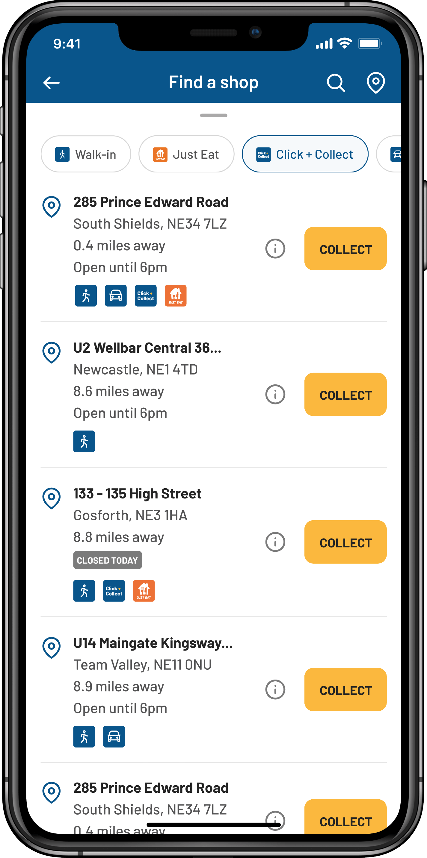
Shop finder list view
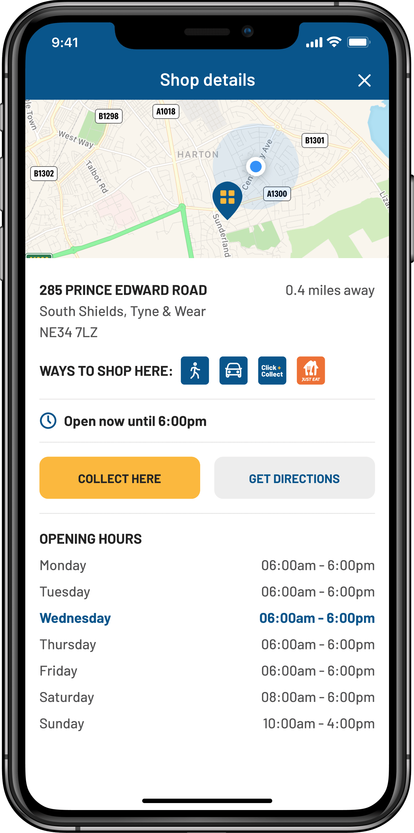
Shop details
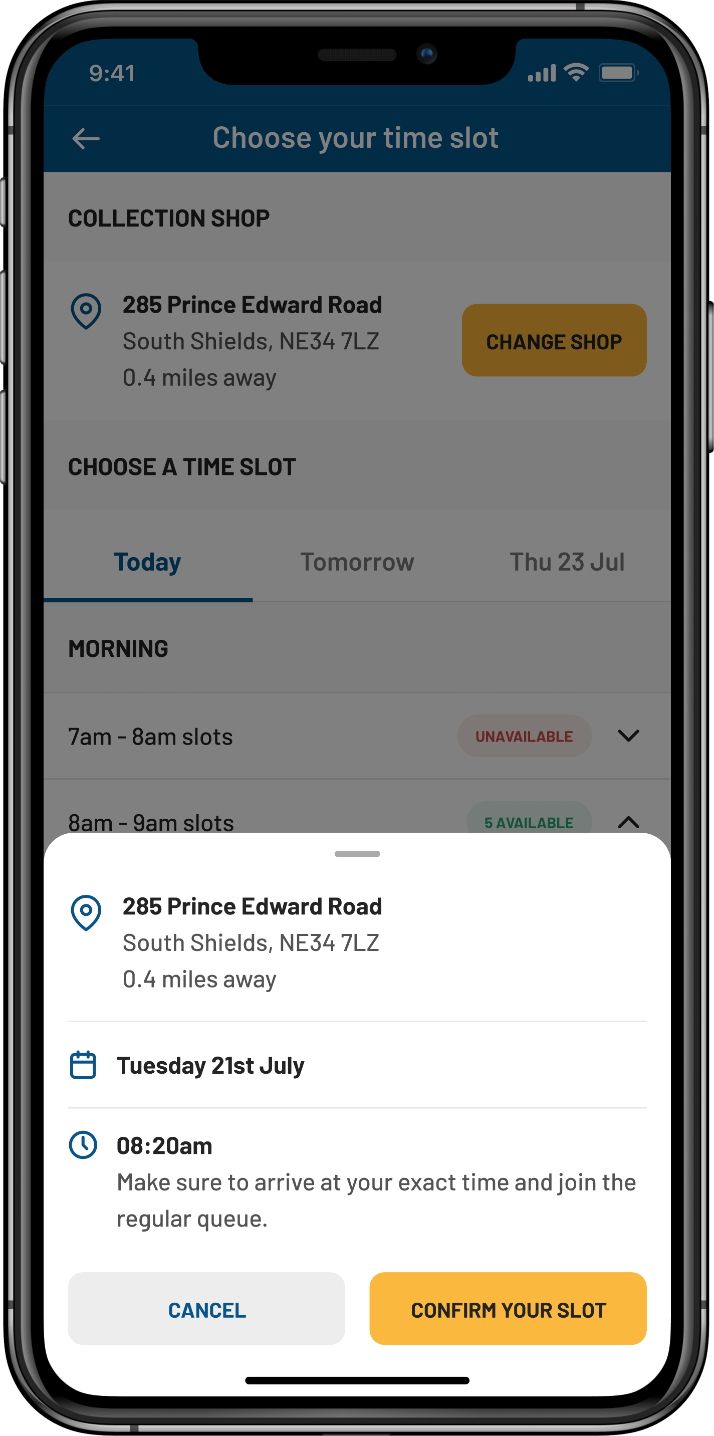
Reserving a time slot
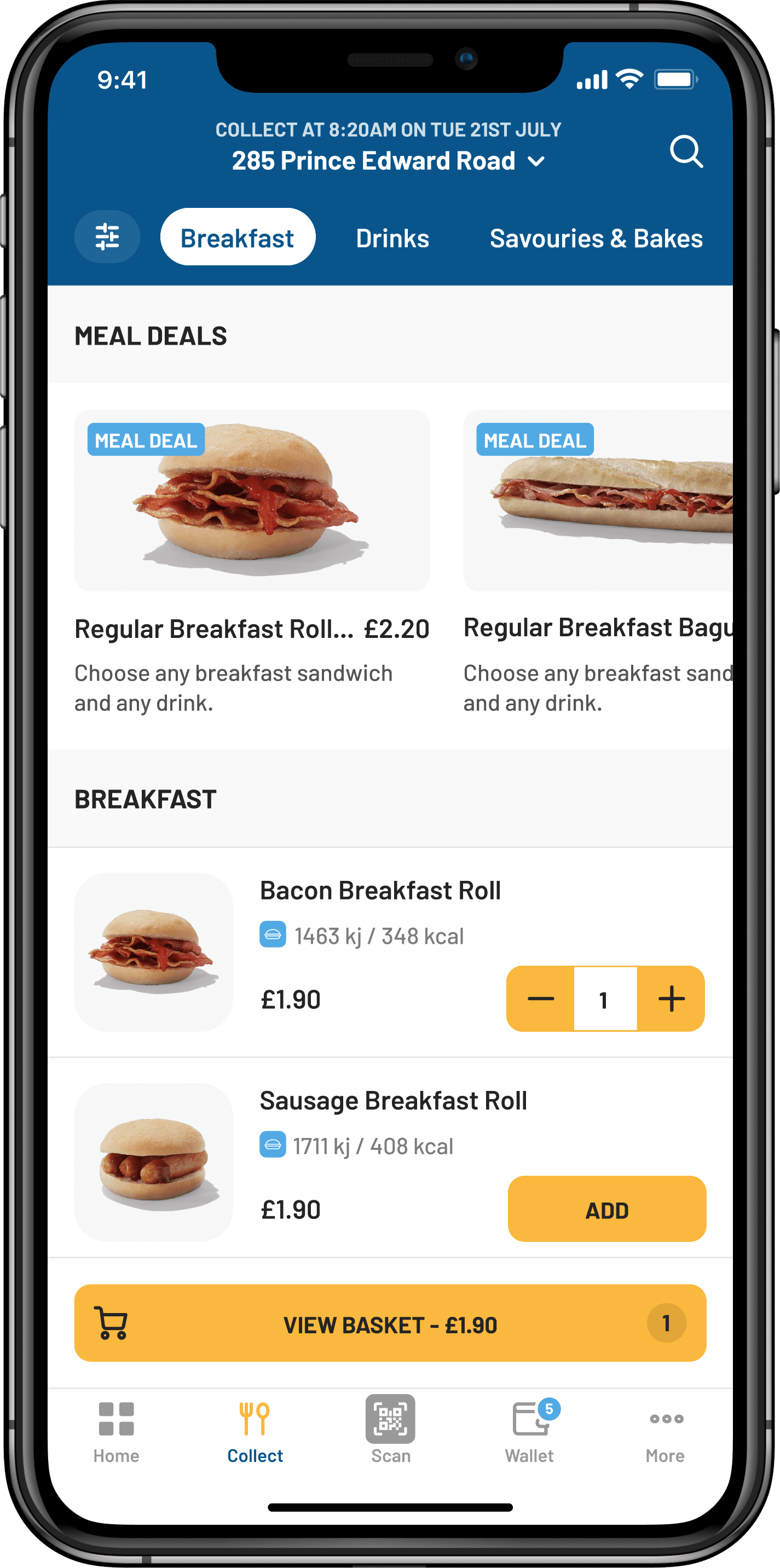
Click + collect menu
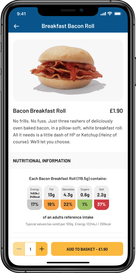
Menu item
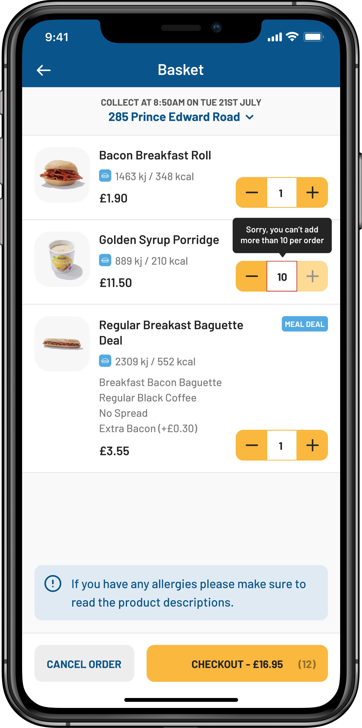
Reviewing a basket
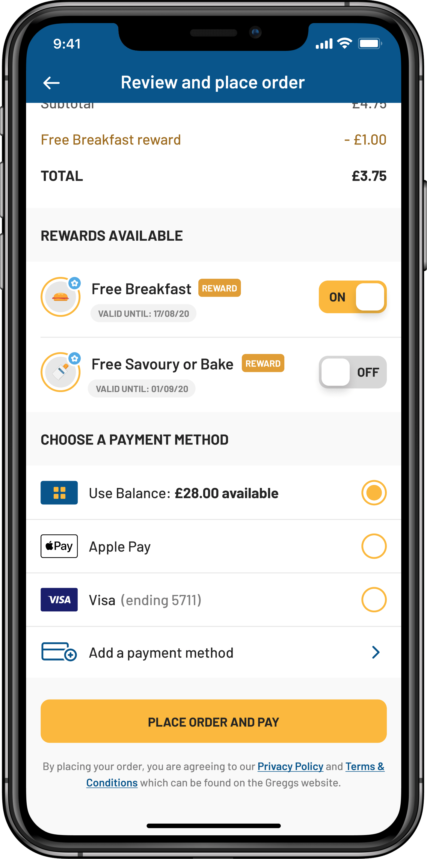
Reviewing an order
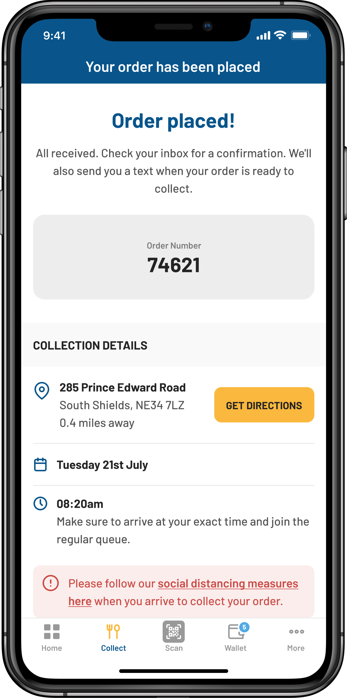
Placing an order
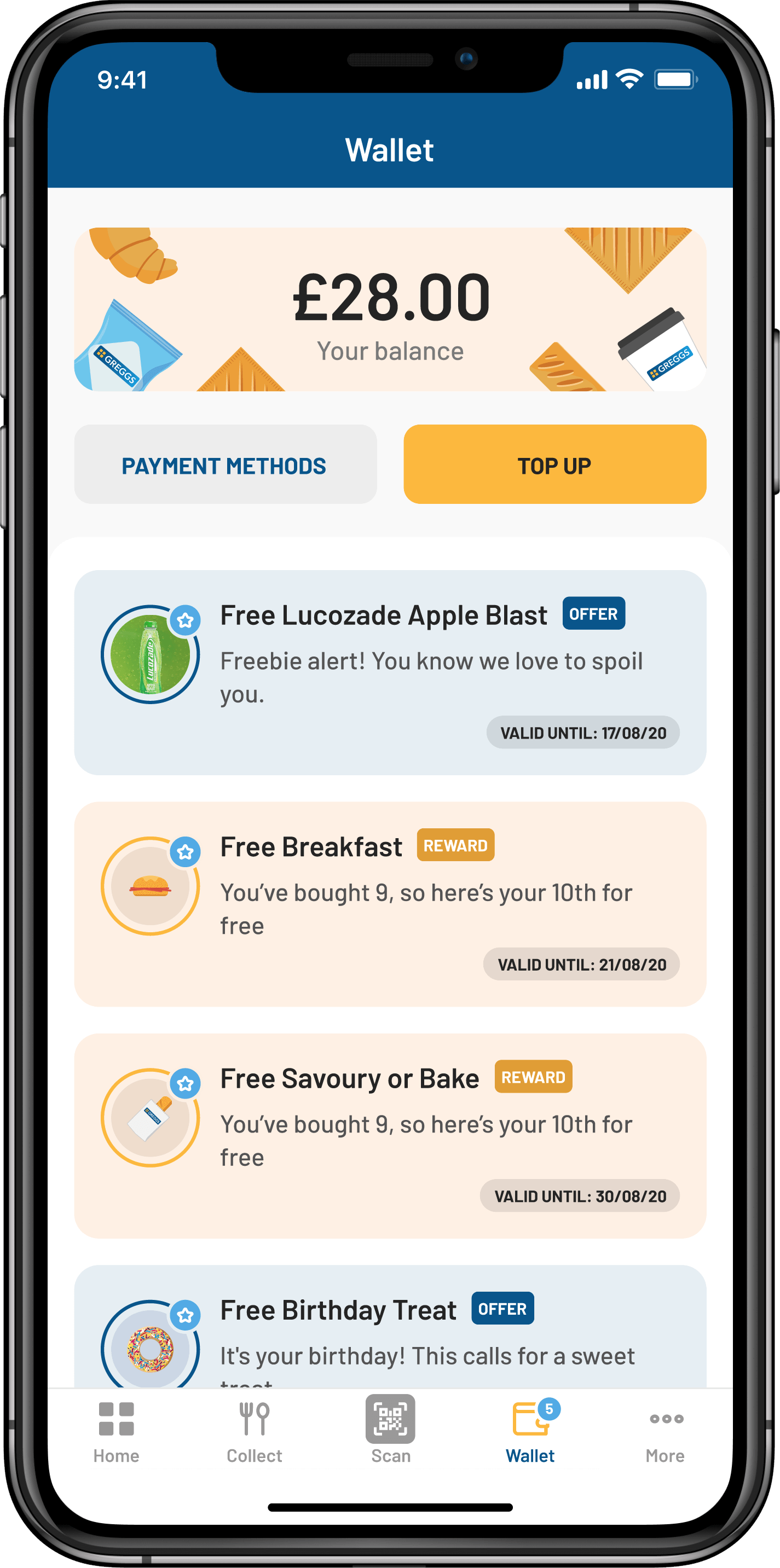
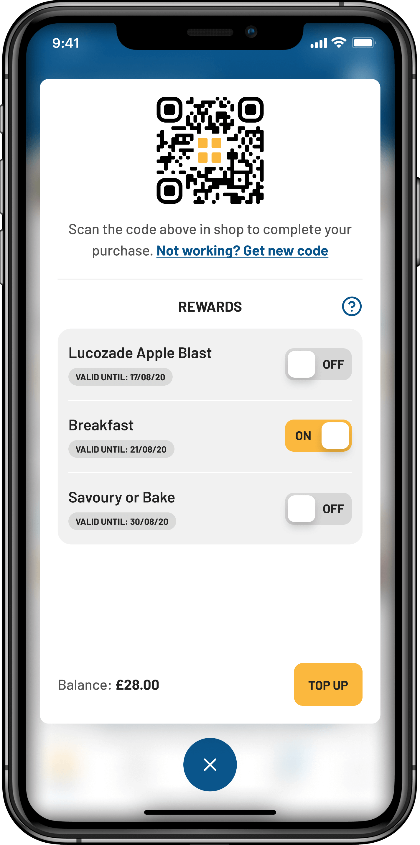
Wallet
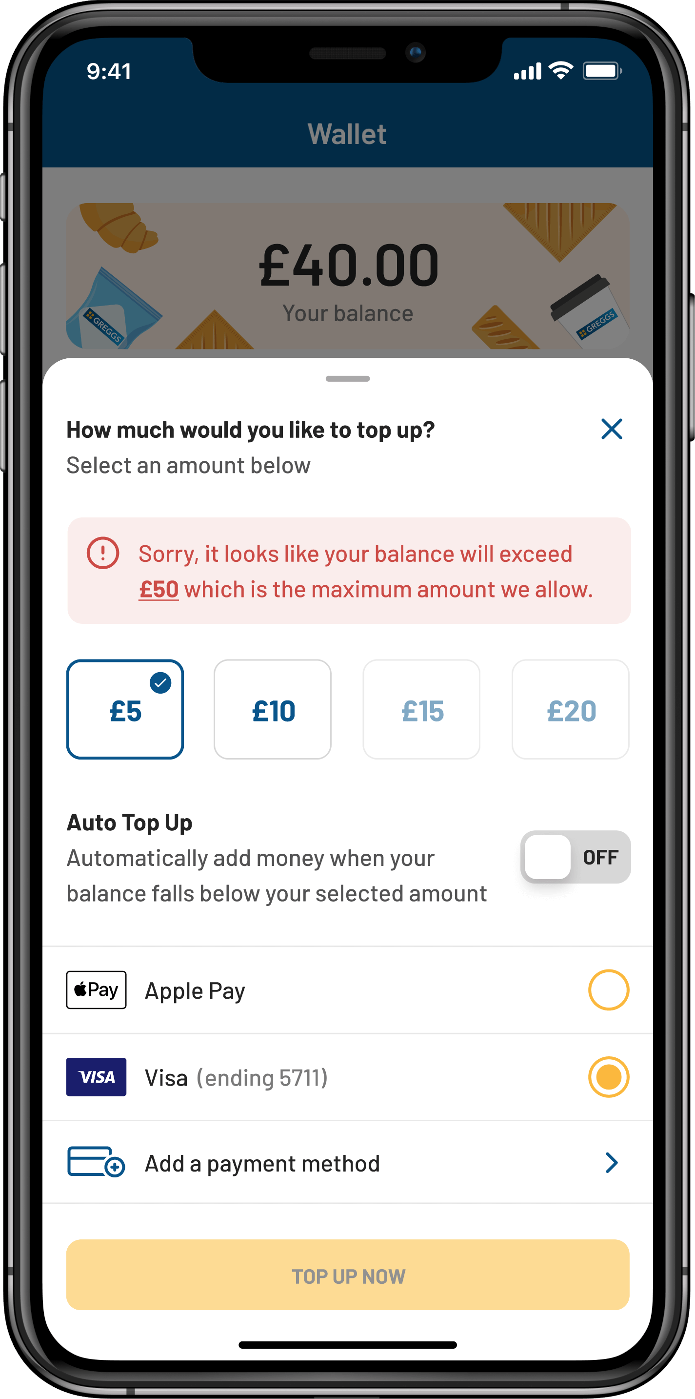
Topping up
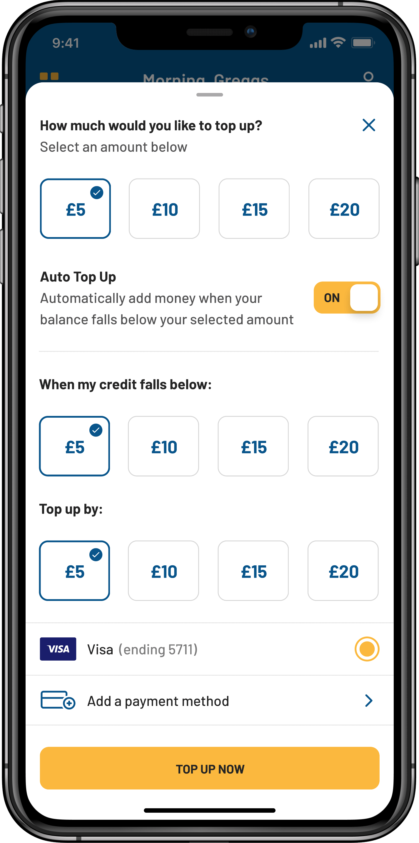
Auto top up
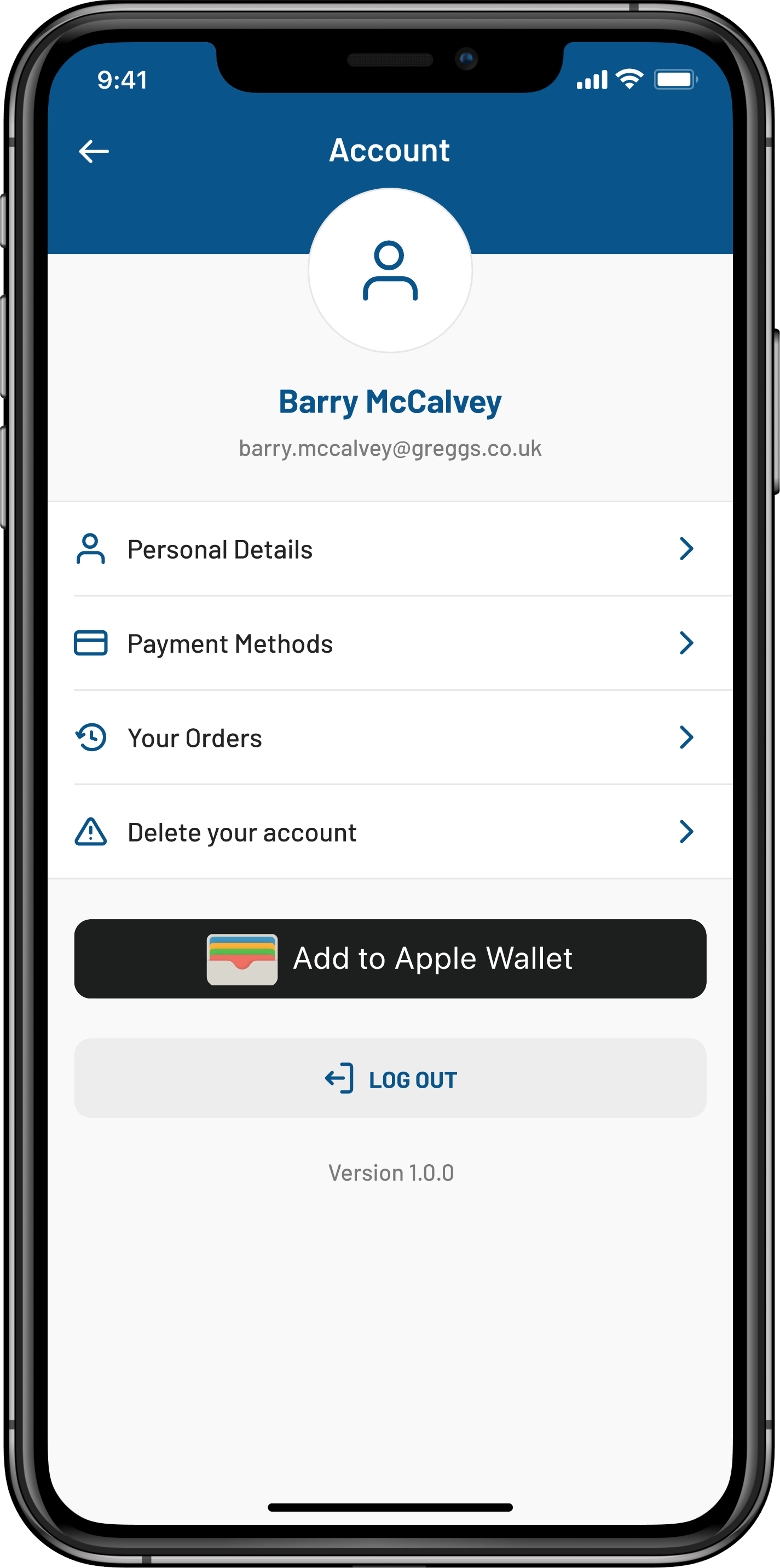
Account
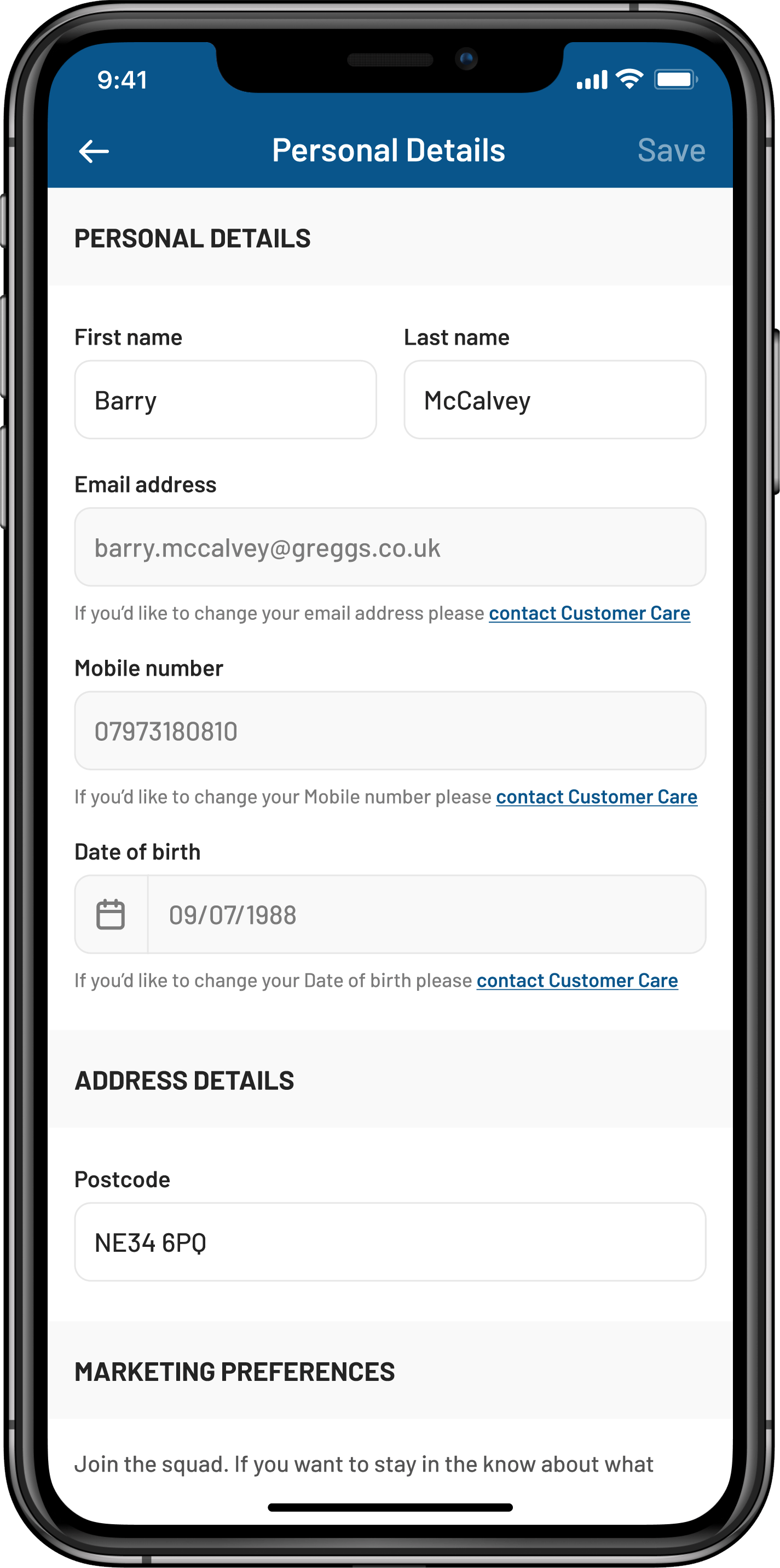
Personal details
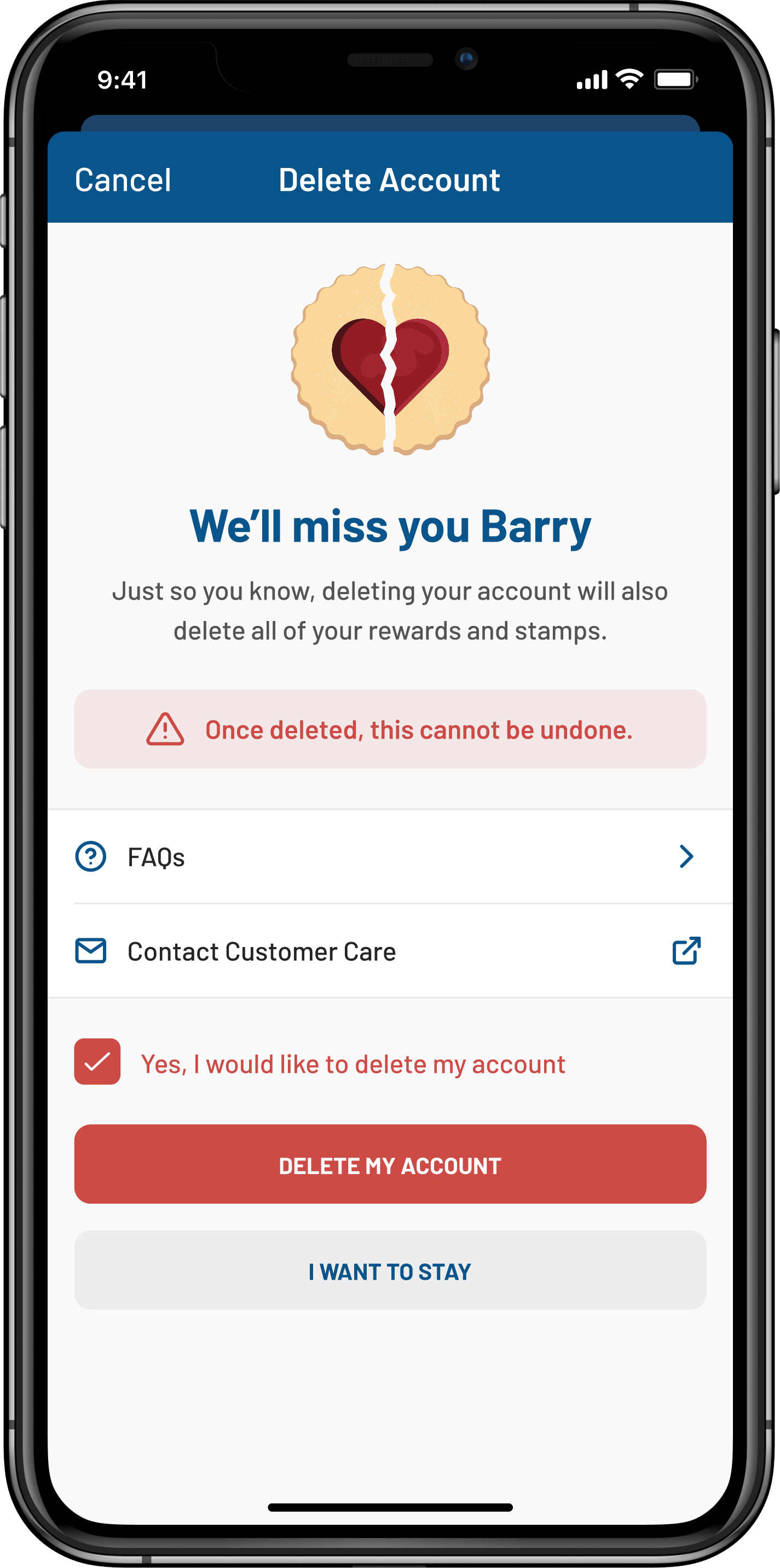
Deleting an account
Before the redesign, the app was simply a digital rewards app but the new version gave customers lots of new benefits like:
![]() Updated visual identity
Updated visual identity
![]() Additional ways for customers to order food using Click + Collect
Additional ways for customers to order food using Click + Collect
![]() New functionality to spend rewards right in the app
New functionality to spend rewards right in the app
![]() New content section to keep up to date with everything Greggs
New content section to keep up to date with everything Greggs
![]() Consistent photography that better showcases the products
Consistent photography that better showcases the products
![]() Improved way to view and spend rewards through the new wallet feature
Improved way to view and spend rewards through the new wallet feature
![]() Streamlined way to top up quickly and see their current balance
Streamlined way to top up quickly and see their current balance
![]() Increased speed of service in-store
Increased speed of service in-store
Whilst I had endeavoured to carry out usability testing throughout the process the main focus of the testing was done through a closed beta of 1000 employees.
This was important as we needed them to be advocates for the app and understand first-hand how it works to be able to troubleshoot with customers at the till if needed. As many would work first-hand with customers this would provide a unique insight into any bugs or usability issues while in-person testing was impossible due to the pandemic.
We also partnered with the internal research team who built a survey to capture feedback during the closed beta. This larger beta and the data we got from it allowed us to test at scale and gave us confidence moving into the public release.
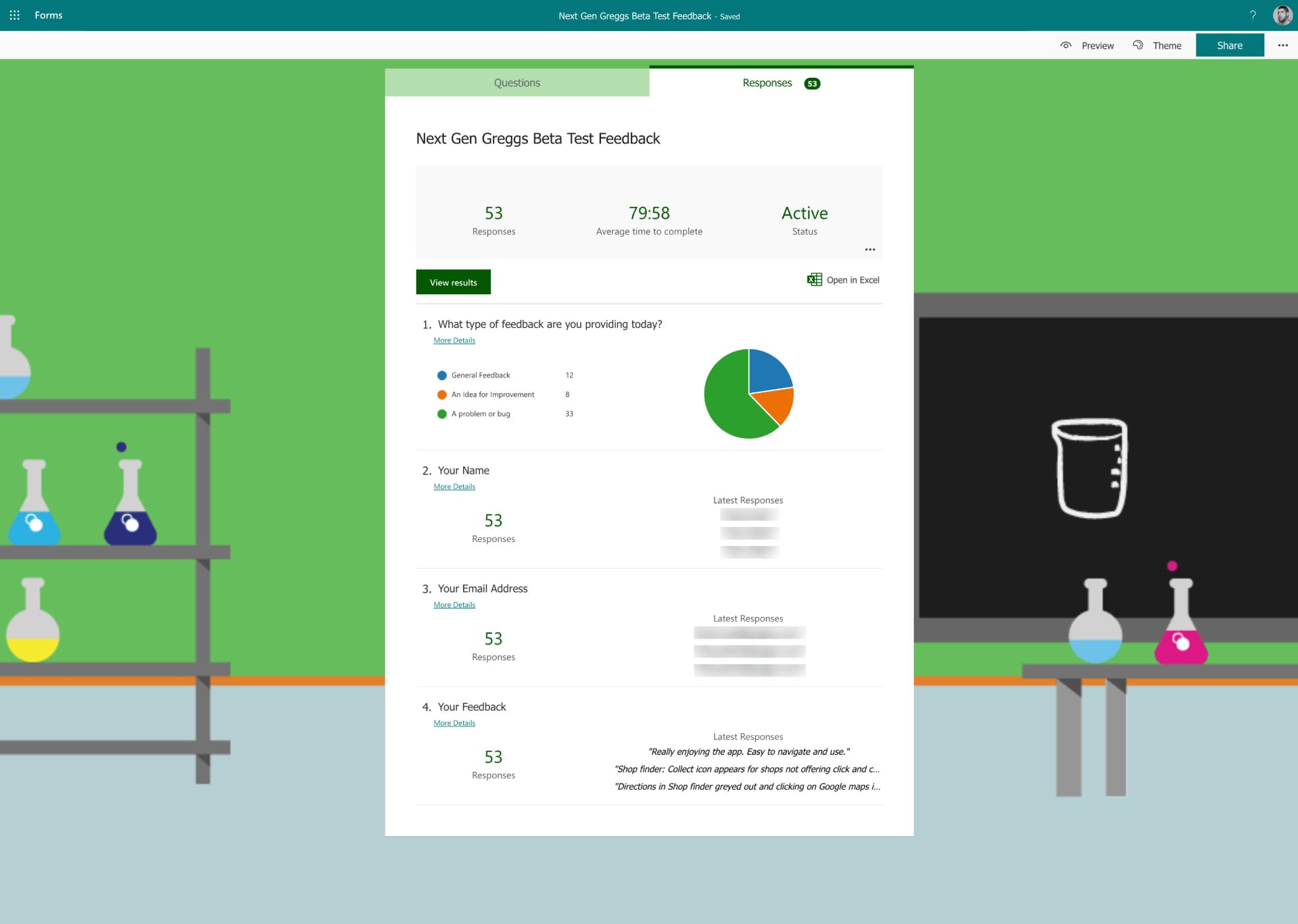
Closed beta testing feedback form
Overall, the feedback was highly positive but some early issues were identified. For example some shops were displaying Click + Collect when they didn’t actually offer it – finding and rectifying things like incorrect tagging of shops before the app went public was vital.
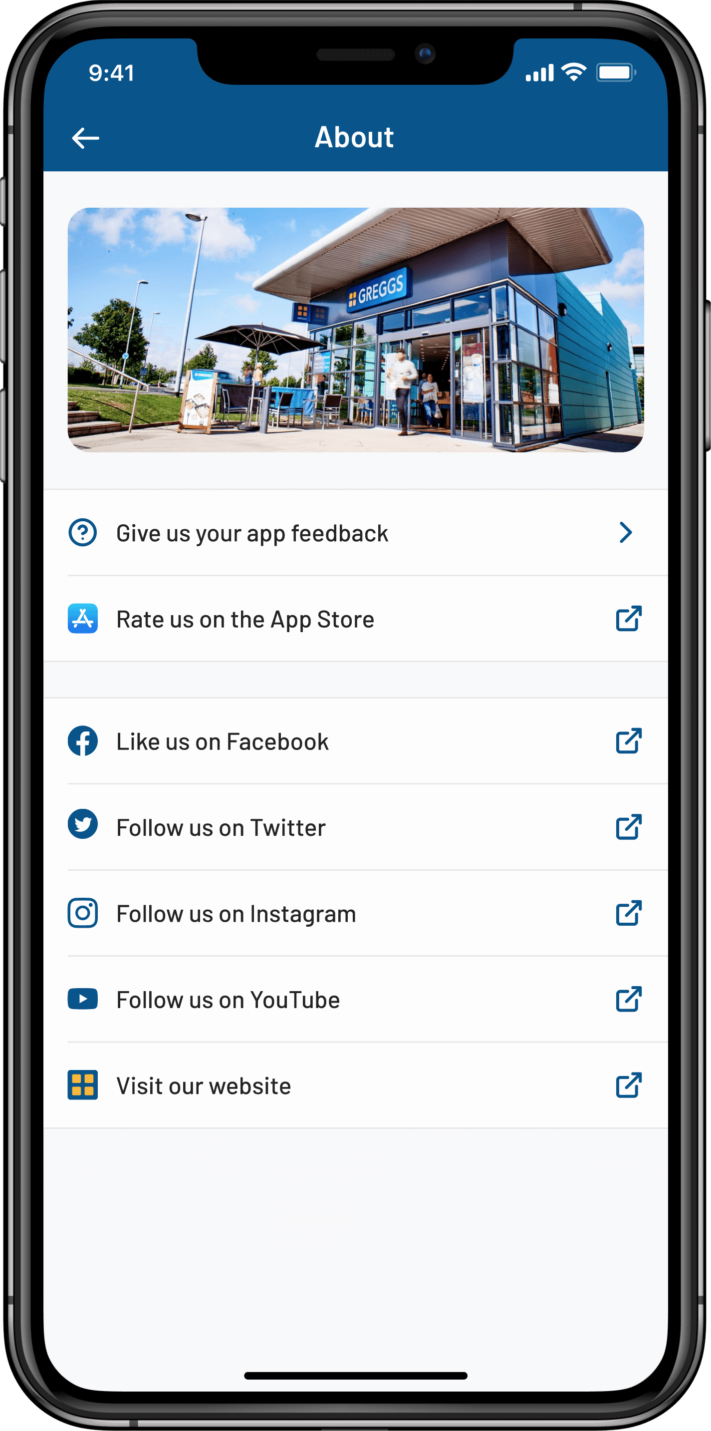
About screen
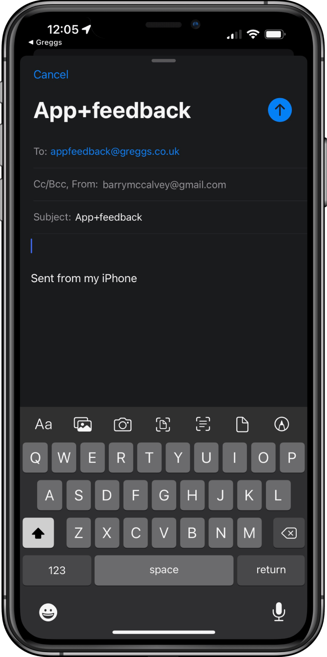
App feedback email
For the public release, I pushed to make sure that we could get as much feedback as possible from within the app and set up an inbox that allowed us to recieve feedback from customers offering them an easy way to do so.
The app is now live in both app stores and is serving 400,000+ customers daily
The app has had over 1 million downloads across iOS and Android
There was a significant increase in the average basket size using the app vs in-store
With me driving design forward the business was able to react to changes much quicker than before which was even more vital as we navigated an ever changing Covid world
Working in a traditional retail business was a new experience for me and presented a number of challenges.
Firstly, the newly established team had agreed to work in an agile way in multifunctional teams. However, this team was only a small component in the wider business. Other key stakeholders worked across a number of separate departments with different levels of experience, some of which were more reluctant to change. New ways of working had to be explained and shared regularly for them to see the benefit.
Secondly, managing stakeholder expectations could sometimes be challenging as each department wanted to sign off designs – each with a different point of view. While it helped make the app more cohesive with the rest of the business, uniting all these requests without compromising the interface or user experience was a real challenge.
My time at Greggs greatly impacted the way I work, strengthening my ability to work collaboratively and lead with empathy and understanding. In particular, it served as a reminder that stakeholders and other external team members are often not as close to the ground making them feel removed from the decision making.
I truly believe there’s nothing stronger than a group of talented people that can collaborate across teams, working to each other's strengths, sharing challenges and celebrating their successes together.