iOS + Android App
July 2021
Levelling up the Hopin event app to allow attendees to better plan
July 2021
Hopin is an online events platform for virtual events that connects people all around the globe. Being founded only a few months before the COVID pandemic hit, Hopin quickly became incredibly valuable in a suddenly virtual world.
But once the world was getting ready to open up again, the company needed to change it’s strategy to create new value propositions for hybrid events with both virtual and onsite attendees.
Hopin scaled from 6 to 1000+ employees over 2 years and was valued at $7.75 billion reaching unicorn status.
Product Design Lead
iOS & Android app
2 Designers
2 Engineers
1 Product manager
1 Engineering manager
My team was specifically working on ways to make the app more useful for hybrid events and was focused on increasing engagement. To kick our team off I ran various product discovery workshops to understand the opportunity space and align our team to our central hypothesis:
This was backed by widely available research from leading events companies in the world:
51% of attendees (hybrid and virtual) want to plan their day before the event starts and 69% want to plan during the event. Scheduling is in the top 5 most valuable components of a mobile events app.
* (2018 Cvent Edelman Study)
User interviews
Ideation workshops
Job story mapping
User flows
UI exploration
Hi-fi designs
Prototyping
Usability testing
Implementation
Lack of research
We didn’t have any foundational research so we had to run customer interviews alongside product discovery, all while prioritising what needed validating for the next iteration.
Dependencies on other teams
We had to balance multiple roadmaps through close collaboration with other teams. Sharing early and often became key to keeping everyone unblocked.
Designing for offline
Our designs needed to work even if the user is offline. We couldn’t always rely on a consistent WiFi connection in large conference halls or at events with multiple locations.
Branded theming
Organisers can set their own colour palette, so our designs needed to be completely flexible and adapt to different themes.
One of the first things I did to get an understanding of the opportunity space was to look at the competition and understand how other best in class apps work. This gave me a good base understanding of what users might expect as pairing with research, we found that users tend to use various different event platforms when attending events.
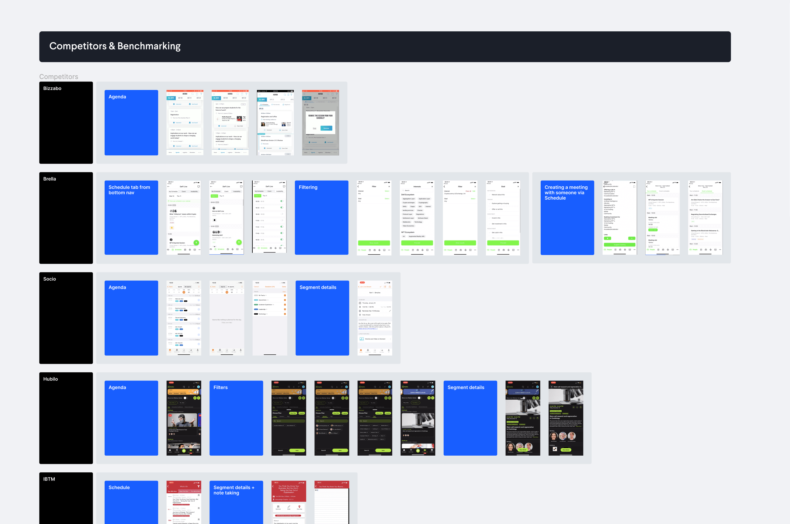
Competitor research in Figma
The lack of research up front, meant that any work on personas would have been loaded with assumptions, so we focused on the jobs to be done instead.
I created and ran a workshop to map out all of the possible low-level jobs based on the overall job story:
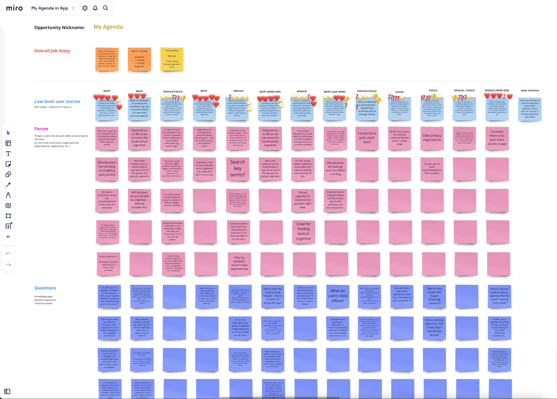
JTBD workshop in Miro
Running this workshop with the product trio meant that we could include different points of view from each discipline right from the start. It was also incredibly useful to help us align and make sure we didn’t miss anything. Identifying constraints and questions early on meant that we could highlight any potential blockers and move forwards together.
We prioritised each job story using the MoSCoW method which resulted in 5 key opportunity areas that defined the scope of the MVP release. The product trio had never worked this way before but they really enjoyed how quickly we were able to flag questions and constraints and move forward together.
With a clear scope, we got the wider team involved in the ideation workshop. Making sure everyone is heard was vital to align the whole team around the same vision – and of course we generated so many more ideas!
To set context for the team I took them through the problem statement all the way through research, insights and the job stories board.
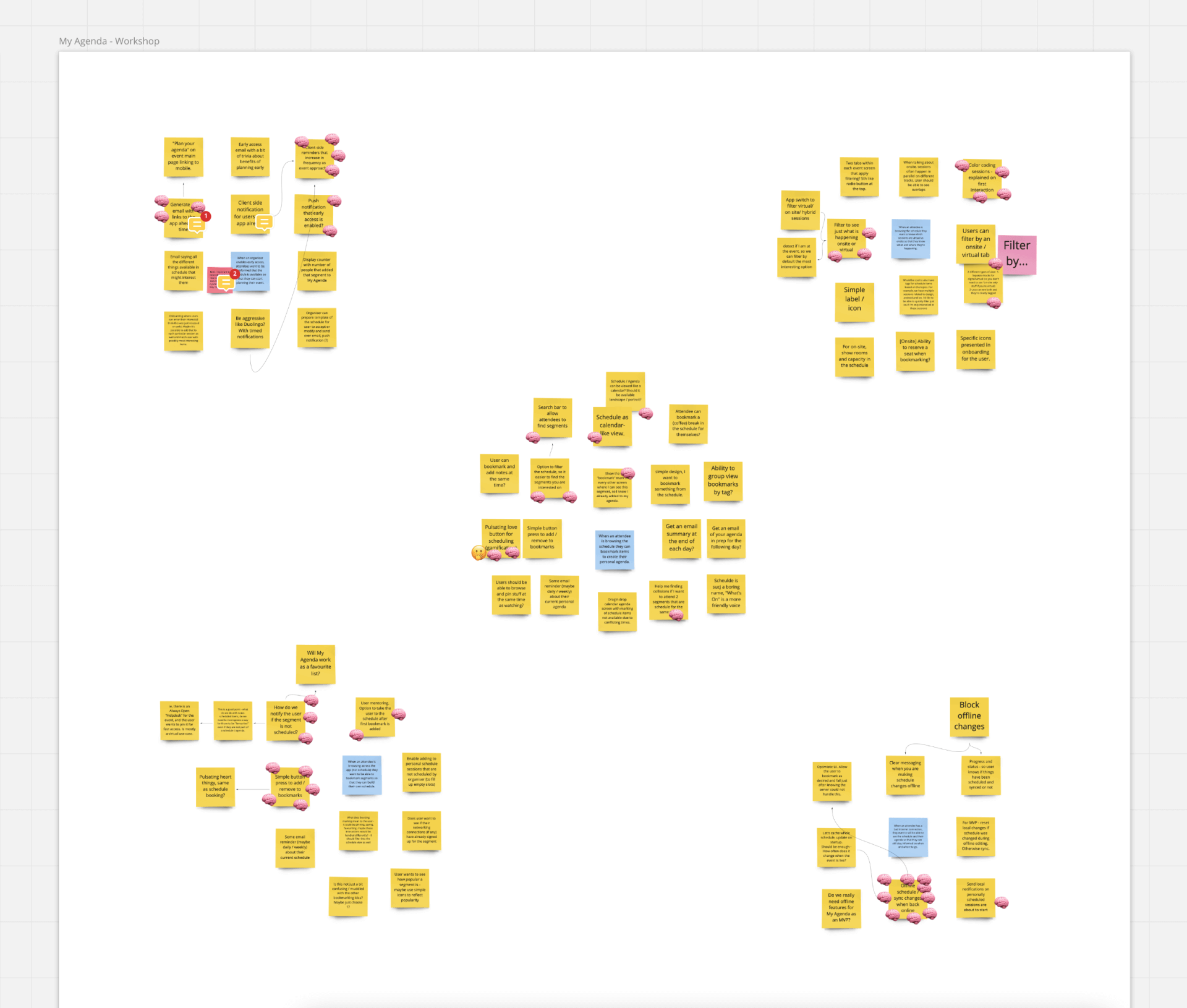
Ideation workshop in Miro
After the whole team had voted anonymously on the many ideas we mapped the top ones onto an effort vs impact scale. This gave us a better understanding of priority and helped inform the initial design.
Both workshops helped to:
Align the team to a shared vision so there are no surprises (nobody likes top down decisions)
Increase team morale and trust by including everyone in the product discovery process
Generate as many ideas as possible in a short amount of time
Understand what was possible as early on in the process as we could
To help the team and myself get a better view of what the end-to-end experience might look like, I also created a user story map based on the top voted job stories. Understanding the work that was needed to deliver this end-to-end experience was key to planning and prioritising our roadmap.
This was a very useful exercise for the team and again, taking the team through key decisions was really important and allowed for some healthy inclusive discussions.
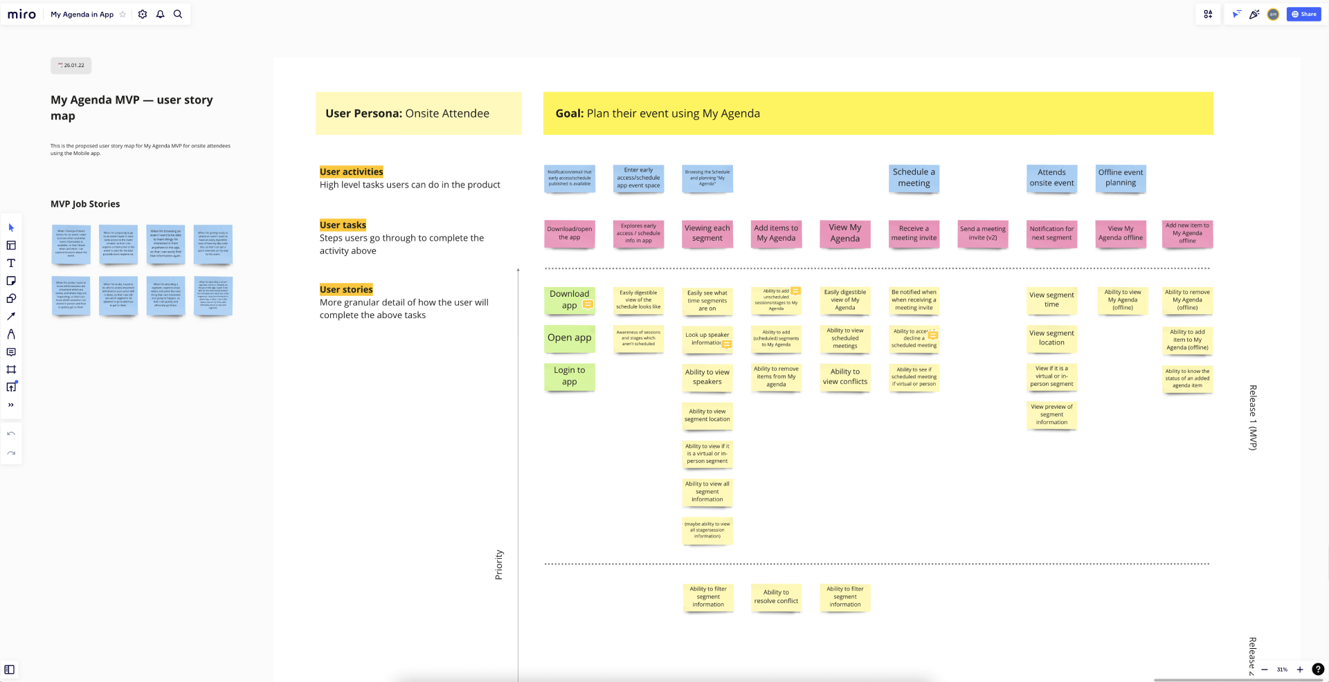
User story map in Miro
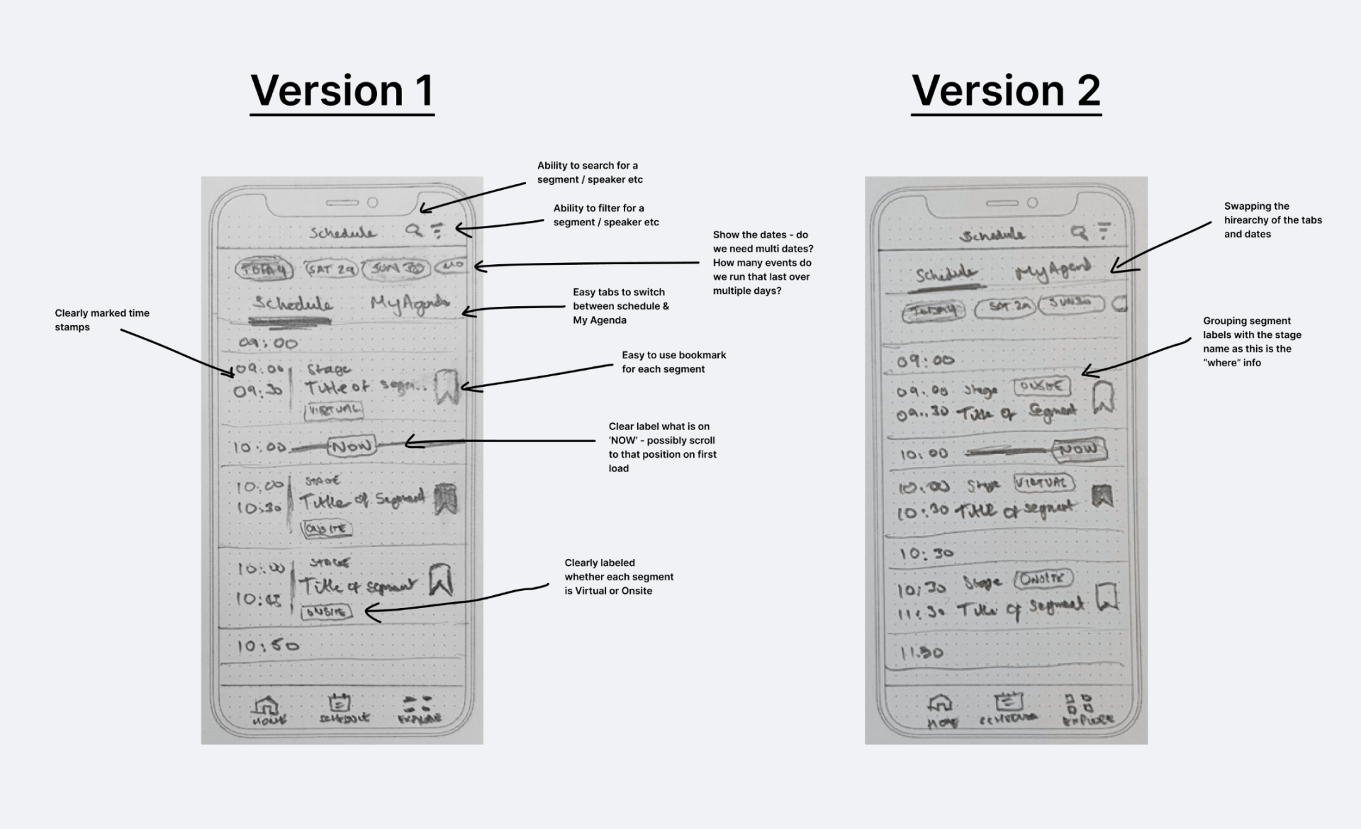
Now that we had a plan, all that was left was the trivial task of bringing it all to life. Myself and the other designer decided to sketch out several of the ideas from our workshop to quickly generate lots of different ideas and give us something tangible to reflect on, discuss, combine and refine.
I’m a big fan of pencil and paper as it’s both incredibly quick to do and very easy to throw away and start again. These early wireframes already gave us a sense of the structure and information architecture.
Early wireframes
Early wireframes
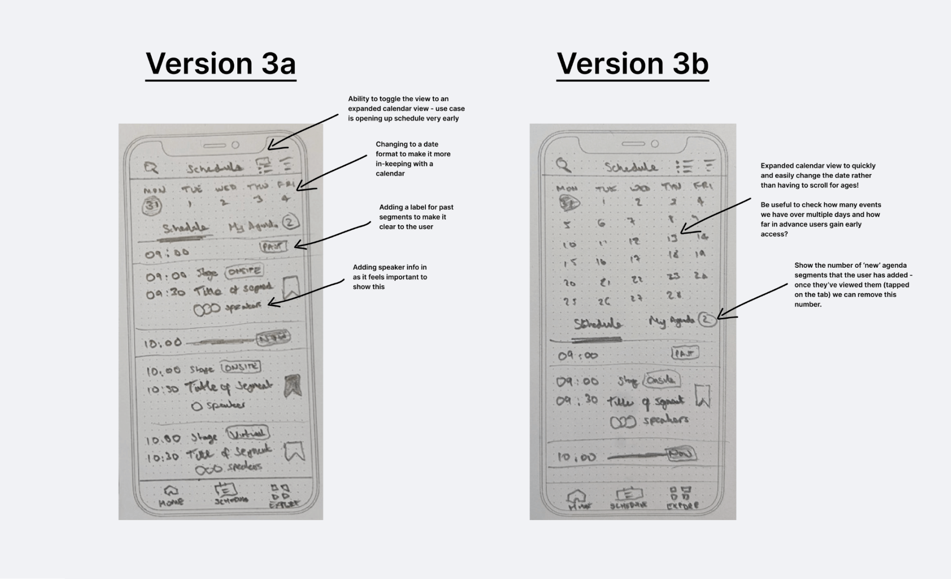
As we moved to higher fidelity designs we got a clearer picture of what we needed to validate first in terms of the structure – for example, should we lead with the date first or the tabs? What happens when the event is just one day vs multiple days?
Again, we worked on these design explorations separately first (all of the work below is my own) and then came together in regular crit sessions to discuss and refine our concepts.

Design iterations in Figma
Component design iterations in Figma
Documenting my chain of reasoning for transparency in Figma
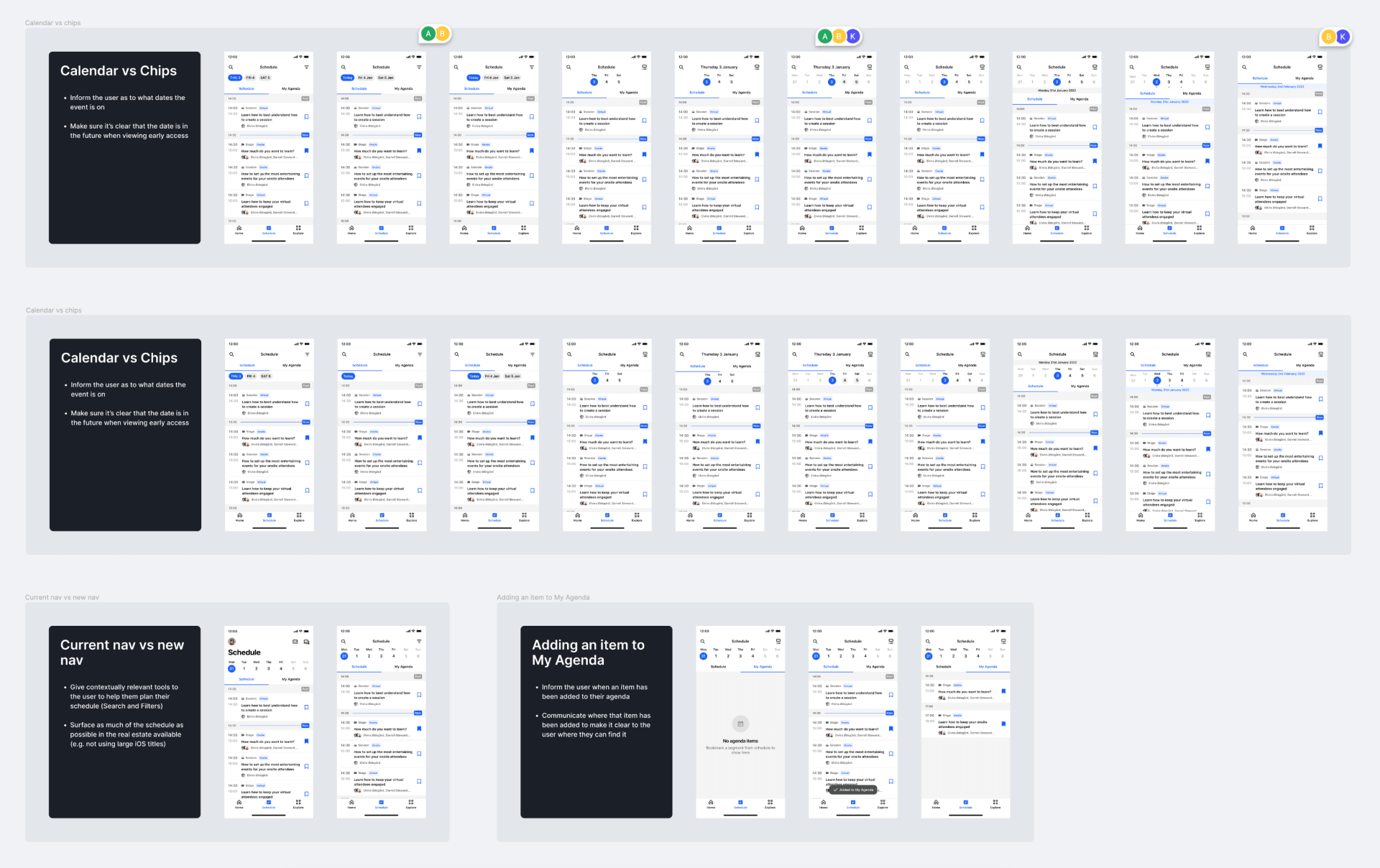
Iterating on flows and edge cases in Figma
Throughout the process I shared my designs early and often with the whole team to allow for a more inclusive approach. Using Figma to collect feedback, collaborate and document decisions in context worked really well.
While moderated testing with real customers is always ideal, it’s not always achievable in the available time. But that doesn’t mean we can’t find alternate ways.
We had an upcoming event where we’d arranged for the feature to be pilot tested, so with a looming deadline we focused on validating key hypotheses in the shortest possible time. We created 3 prototypes for the most contentious aspects of the feature and ran them as unmoderated tests on usertesting.com, getting results back in just hours. The three scenarios were:
1. Viewing and adding to My Agenda and offline mode
2. Accepting, rejecting, and changing a meeting invite
3. Viewing information from “past” content
We sourced 7 participants from different backgrounds, the main qualifier was that they had all attended at least 1 event in the last 3 months.
The main challenge with running these tests asynchronously was writing clear prompts and questions. We wouldn’t be there to help users if they got stuck, or to probe them further if our questions were not specific enough. Myself and the other designer iterated several rounds on the script internally before going live with the test. The results that came back had a near 100% task completion rate and some very clear, actionable feedback which gave us enough confidence in moving forward into finalising the designs for development.
3 amigos
Refinement
Build
Design QA
Release
Retro
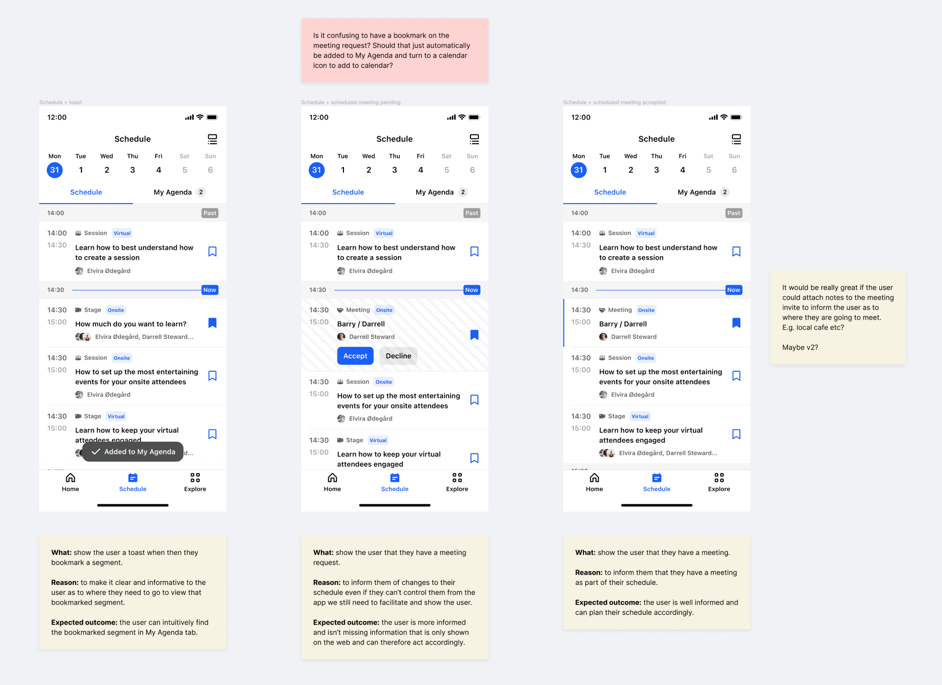
After synthesising the findings and sharing them with the wider team, along with the other designer we moved into creating extensive spec documents in Figma to be implemented. In addition to defining the new UI, I built specific prototypes to show detailed interaction states.
I also helped foster a more iterative approach to the design handover process by introducing a new Design QA step in the process. This was used to not only make sure quality was always at the forefront but also to make sure there was a collaborative partnership between design and engineering.
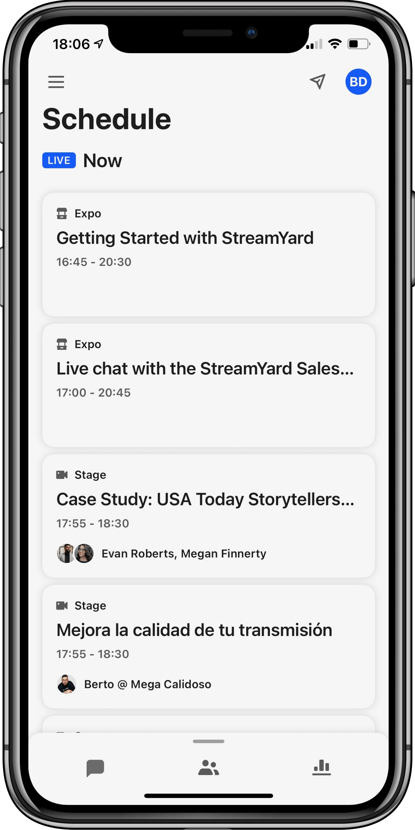
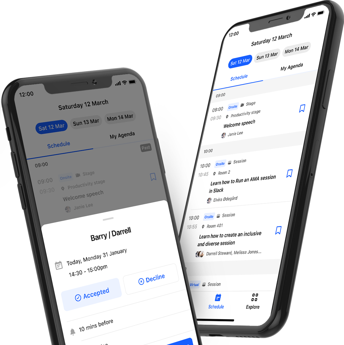
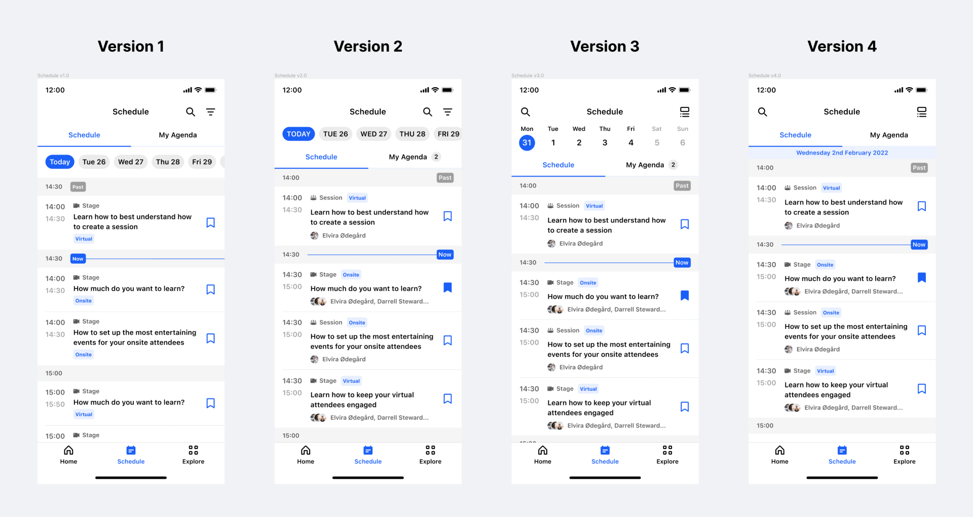
Before: Original schedule
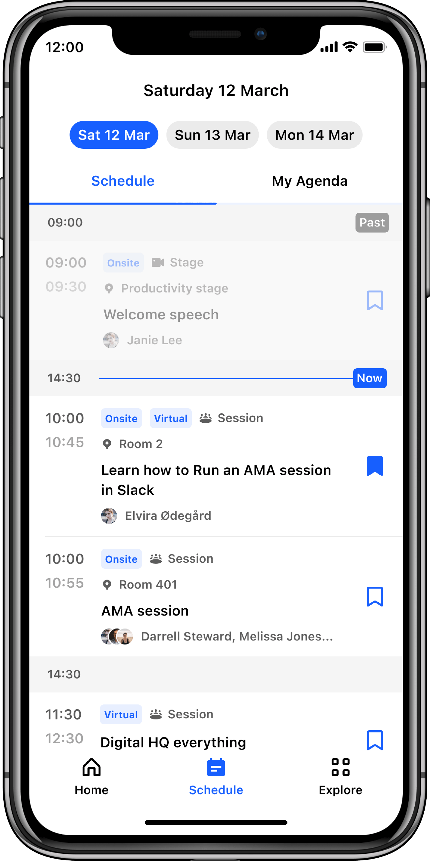
After: Redesigned schedule
Before the redesign, the schedule essentially just repeated some basic information and it only became available to users once the event started. This didn’t allow attendees to plan ahead, forcing them to figure it all out while the event was happening.
There was also no way to personalise it by building your own schedule. Networking and meetings were nonexistent in the schedule despite being one of the main reasons attendees go to events.
Finally, the schedule did not consider the onsite attendee, lacking vital information like the physical locations of sessions.
With the redesign we’re giving attendees the following benefits:
![]() Clearer content hierarchy
Clearer content hierarchy
![]() Clear labelling of virtual and onsite sessions
Clear labelling of virtual and onsite sessions
![]() Brand new bookmarking functionality for quick access to specific talks
Brand new bookmarking functionality for quick access to specific talks
![]() Brand new My Agenda feature allowing attendees to plan their day
Brand new My Agenda feature allowing attendees to plan their day
![]() Brand new ability to RSVP to meetings right in the app making sure attendees never miss a meeting again
Brand new ability to RSVP to meetings right in the app making sure attendees never miss a meeting again
![]() Clear differentiation of past and upcoming sessions, helping users quickly see what’s happening right now
Clear differentiation of past and upcoming sessions, helping users quickly see what’s happening right now
![]() Brand new offline mode allowing attendees to check the schedule anytime, anywhere
Brand new offline mode allowing attendees to check the schedule anytime, anywhere
The feature is currently in build and we’re exploring what the next iterations might include whilst continually getting research and customer insight on our first release.
One iteration we’re currently exploring which aligns with our new hybrid strategy is giving attendees and organisers the ability to see how popular different sessions are.
Working at this unicorn startup had a lot of challenges in terms of speed of decision making, pivoting and communication but I feel that I did a great job to help our team stay focused on the task at hand and be an ambassador of a much more collaborative way of working.
Getting input from the product trio and wider team more quickly and more often was a key factor in keeping up the momentum and unblocking ourselves by chatting through design challenges in impromptu crit sessions throughout.